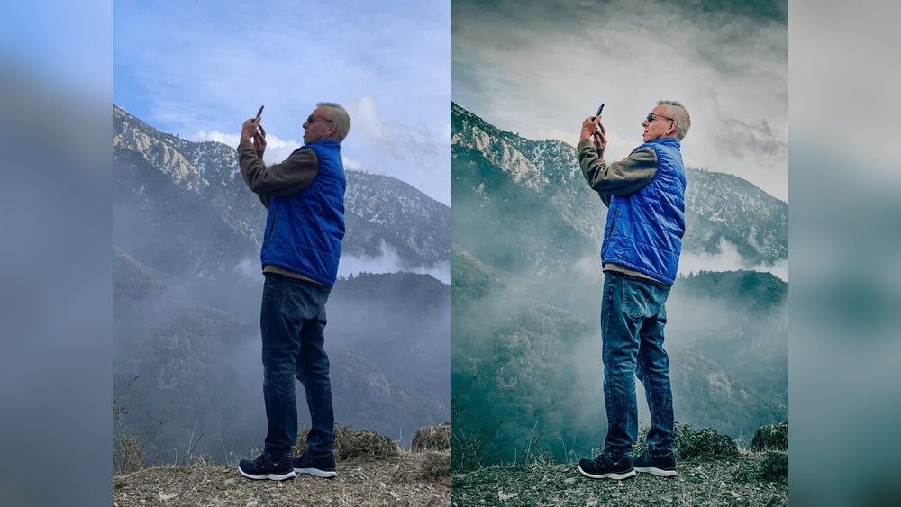
Are you tired of using preset colors that don’t quite match your vision? Editing preset colors can transform your projects from ordinary to extraordinary, giving you full control over the look and feel of your work.
Whether you’re working in Photoshop, Lightroom, or any other design tool, knowing how to customize these colors is a game-changer. In this guide, you’ll discover simple, step-by-step methods to tweak preset colors quickly and effectively. Ready to unlock the full potential of your designs?
Keep reading, and you’ll learn how to make every color work perfectly for you.
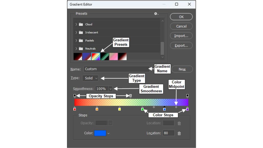
Credit: www.teachucomp.com
Choosing Your Base Palette
Start by selecting a base palette that suits your project’s mood. Adjust preset colors by changing hue, saturation, or brightness to fit your style. Small edits can create a unique and balanced look.
Understanding Your Project Needs
Start by thinking about your project’s mood and style. Choose colors that match the feeling you want to create. Bright, bold colors work for lively designs. Soft, muted tones suit calm and elegant looks. Knowing your goal helps pick the right base palette.
Selecting A Color Harmony
Color harmony means how colors look together. Use harmony rules like complementary, analogous, or triadic schemes. Complementary colors are opposite on the color wheel and create contrast. Analogous colors sit next to each other and feel peaceful. Triadic colors form a triangle and offer balance. Pick a harmony that fits your design.
Choosing A Limited Number Of Colors
Less is more with base palettes. Select about three to five main colors. Too many colors can confuse the eye. A small palette keeps your design clean and consistent. Make sure your colors work well in different lighting and screens.
Testing Your Colors In Context
Try your chosen colors in sample layouts or mockups. See how they look with text, backgrounds, and images. Adjust brightness and saturation if needed. Testing helps catch issues early. It ensures your palette looks good on all devices.
Accessing Preset Colors
Accessing preset colors is the first step in customizing your design palette. Preset colors save time by offering ready-made color options. You can find them in many design and photo editing software.
Knowing where and how to access these presets helps you work faster. It also keeps your project colors consistent. Let’s explore common ways to access preset colors.
Accessing Preset Colors In Photoshop
Open Photoshop and create or open a document. Click on the foreground color square in the toolbar. This action opens the Color Picker window. Here, choose the “Swatches” tab. It displays preset color swatches you can select.
You can also find preset colors under the “Window” menu. Choose “Swatches” to open a panel with preset colors. Click any swatch to apply the color instantly.
Accessing Preset Colors In Lightroom
In Lightroom, preset colors come with presets or profiles. Open the Develop module to start editing. On the left panel, find the Presets section. Click the arrow to expand it and view preset color options.
Hover over any preset to preview its effect. Click to apply it to your photo. Lightroom also lets you create and save your own color presets for future use.
Accessing Preset Colors In Illustrator
Launch Illustrator and open your artwork. Go to the “Window” menu and select “Swatches.” The Swatches panel shows preset colors and gradients. You can add or remove colors here.
For more color themes, open the “Color Themes” panel from the “Window” menu. It provides groups of preset colors based on different themes and moods. Click any color to use it in your design.
Adjusting Hue And Saturation
Adjusting hue and saturation is a key step to change preset colors effectively. Hue shifts the color tone, while saturation controls its intensity. These two settings help customize colors to fit your style or project needs.
Changing hue lets you move colors along the color spectrum. This means red can become orange, blue can turn to green, and so on. Adjusting saturation makes colors more vivid or muted. Lower saturation creates a soft, faded look. Higher saturation produces bright, bold colors.
What Is Hue Adjustment?
Hue adjustment changes the base color of your preset. It rotates colors around the color wheel. For example, blue can shift toward purple or green. This helps create unique color variations. Hue adjustment is useful for matching colors to a theme or mood.
How To Adjust Saturation
Saturation controls how strong or weak a color appears. Increasing saturation makes colors look richer and more alive. Decreasing it makes colors dull or washed out. Use saturation to balance colors so they do not overpower your design.
Tips For Effective Hue And Saturation Editing
Make small adjustments for subtle color changes. Large shifts can make colors look unnatural. Use preview tools to see changes in real time. Keep original colors in mind to maintain harmony. Experiment with both hue and saturation for best results.
Modifying Brightness And Contrast
Modifying brightness and contrast is key to adjusting preset colors effectively. These two settings control how light or dark and how vivid the colors appear. Brightness changes the overall light level, making colors lighter or darker. Contrast adjusts the difference between the darkest and lightest parts. Together, they help create the perfect mood and clarity in your image.
Changing these settings can enhance details that preset colors alone might miss. It brings depth to flat colors and makes images more appealing. Small tweaks can make colors pop or soften the look for a calm feel. Understanding how to edit brightness and contrast lets you customize presets to fit any style or lighting condition.
Understanding Brightness Adjustment
Brightness controls the lightness of the entire image or color preset. Increasing brightness makes all colors lighter. Decreasing brightness makes the colors darker. This adjustment helps fix images that look too dark or dull. Use small steps to avoid washing out details or losing color richness.
How To Adjust Contrast
Contrast changes the difference between light and dark areas. High contrast creates sharp edges and vivid colors. Low contrast results in a softer, more muted look. Adjust contrast carefully to keep natural color balance. Too much contrast can cause harsh colors and loss of detail.
Tips For Balanced Brightness And Contrast
Start by setting brightness for overall light level. Then fine-tune contrast to enhance details and texture. Check the image on different screens to ensure consistency. Avoid extreme changes that can make colors look unnatural. Use preview tools in your editing software to compare before and after effects.
Using Color Mixer Tools
Using color mixer tools is a simple way to change preset colors. These tools let you adjust colors precisely. You can blend hues and create new shades. It helps to match colors to your style or project needs.
Color mixers work by mixing red, green, and blue values. You can also adjust brightness, saturation, and contrast. This control makes your presets unique and perfect for your design.
Understanding The Color Mixer Interface
The color mixer interface usually shows sliders or color wheels. Sliders change the amount of red, green, and blue. Color wheels let you pick colors by moving a pointer around. You can see the color change in real time.
Some mixers also show numeric values for color codes. This feature helps if you want exact color matching. It is useful for branding or consistent design themes.
Adjusting Hue, Saturation, And Brightness
Hue changes the actual color tone, like red to blue. Saturation controls how intense or dull the color looks. Brightness changes how light or dark the color appears.
Adjusting these three settings lets you fine-tune preset colors. You can create softer or stronger colors to suit your needs. This step is important for getting the right mood in your design.
Saving And Applying Edited Colors
After adjusting colors, save your new presets. Most tools allow you to save with a new name. This way, your original presets stay unchanged.
Apply the edited colors to your project easily. The saved presets can be reused anytime. This saves time and keeps your work consistent.

Credit: support.goodnotes.com
Applying Selective Color Edits
Applying selective color edits lets you change specific colors in your preset. This approach improves images without affecting the whole photo. It helps enhance details and create a better look.
Selective color editing focuses on one color or a small range of colors. You can adjust hue, saturation, and brightness for those colors only. This method gives more control and precision.
Understanding Selective Color Tools
Many photo editors offer selective color tools. These tools isolate colors based on range or tone. They allow you to tweak reds, blues, greens, or any other color. Each color can be edited separately for better results.
Choosing Colors To Edit
Start by picking the color you want to change. Use the color picker or eyedropper tool in your editor. Select the color from your image or preset palette. This step ensures you edit the exact shade you want.
Adjusting Hue, Saturation, And Lightness
After selecting a color, adjust its properties. Hue changes the color tone. Saturation controls the intensity or dullness. Lightness affects how bright or dark the color appears. These tweaks refine the color to fit your style.
Fine-tuning Color Ranges
Colors often blend into nearby shades. Use range sliders to include or exclude colors. Narrow ranges target specific shades precisely. Wider ranges affect more colors but less selectively. Find the balance for smooth transitions.
Previewing Changes Before Saving
Always preview your edits on the image. Toggle the effect on and off to see differences. Check if the changes improve the photo or preset look. This step avoids unwanted color shifts or errors.
Saving Custom Color Presets
Saving custom color presets allows you to reuse your favorite color settings. This saves time and keeps your designs consistent. Once you create a custom color, save it as a preset for easy access later.
Custom color presets help maintain your unique style. They work in many design programs and photo editors. By saving presets, you avoid repeating the same adjustments again.
How To Name Your Custom Color Preset
Choose a clear and simple name for your preset. Use words that describe the color or its use. This makes it easy to find the preset later. Avoid long or complex names to keep things simple.
Steps To Save A Custom Color Preset
After selecting your custom color, look for the save or add preset button. Click this button to open the save menu. Enter the name and confirm to save your preset. Your color is now ready to use anytime.
Managing Saved Color Presets
Organize your saved presets regularly. Delete presets you no longer need to keep your list clean. Rename presets if their purpose changes. This helps find the right color quickly during projects.
Using Saved Presets In Different Projects
Load your saved presets in new projects to keep colors consistent. Most programs allow importing and exporting presets. Share your presets with teammates or across devices for smooth workflows.
Organizing Your Color Swatches
Organizing your color swatches helps keep your presets easy to find. A tidy palette saves time during editing. It also improves workflow and creativity. Grouping similar colors or themes creates order. Labels and folders add clarity. This section explains how to arrange swatches well for better editing.
Creating Color Groups
Start by grouping colors with similar tones or uses. For example, place all warm tones in one folder. Cool tones can go in another. This method reduces scrolling and searching. It makes finding the right color quick and simple. Use clear names for each group to avoid confusion.
Renaming Swatches Clearly
Give each swatch a name that describes the color well. Avoid vague names like “Color 1” or “Preset A.” Instead, use names like “Sky Blue” or “Soft Pink.” Clear names help you remember and select colors fast. They also make sharing presets with others easier.
Deleting Unused Colors
Remove any swatches you no longer use. Old or duplicate colors clutter your palette. Deleting them keeps your swatches clean and focused. This step improves your editing speed and accuracy. Make sure to back up important colors before deleting.
Using Swatch Libraries
Save your organized swatches as libraries for future use. Libraries allow easy access across projects. They also help keep colors consistent in your work. You can import and export libraries to share with others. This practice streamlines color management and saves effort.
Testing Colors Across Projects
Testing colors across projects is essential for consistent design. It helps ensure your preset colors look good in different settings. Colors may appear different depending on the background, lighting, or project style.
Testing allows you to spot issues early. It avoids redoing work later. You gain confidence that your colors suit various uses. This process saves time and keeps your designs professional.
Creating Sample Files For Color Testing
Start by making simple sample files. Use different backgrounds and elements in these files. Apply your preset colors to text, shapes, and other objects. This helps you see how colors behave in various contexts.
Test samples in both light and dark modes. Try different screen sizes if possible. This wide testing shows if colors maintain their clarity and appeal everywhere.
Comparing Colors In Real Project Environments
Next, test your colors in actual project files. Insert your presets into ongoing designs. Observe how colors interact with other elements like photos and graphics.
Note any color clashes or readability problems. Adjust presets based on these observations. Real project tests reveal practical strengths and weaknesses.
Using Color Tools For Accurate Testing
Use digital tools to check color accuracy. Color pickers and contrast analyzers help measure color values precisely. These tools ensure your presets meet accessibility standards.
Test colors under different lighting conditions using software or physical devices. Accurate testing confirms your colors work well for diverse audiences.
Troubleshooting Color Inconsistencies
Color inconsistencies can disrupt your workflow when editing preset colors. These issues often arise from software settings, device displays, or file formats. Understanding how to identify and fix these problems keeps your colors accurate and consistent.
Small color shifts may seem minor but affect the final look significantly. Troubleshooting helps maintain the intended style and quality of your project. Below are key steps to resolve common color inconsistencies.
Check Your Color Profile Settings
Color profiles control how colors appear on different devices. Mismatched profiles cause colors to look different than expected. Ensure your software and monitor use the same color profile, such as sRGB or Adobe RGB. This alignment prevents unwanted color shifts.
Calibrate Your Monitor Regularly
Monitors can display colors inaccurately without calibration. Use calibration tools to adjust brightness, contrast, and color balance. Calibration ensures your screen shows true colors, making it easier to edit presets correctly.
Verify File Format Compatibility
Some file formats handle colors better than others. Using incompatible formats can cause color changes when opening or exporting files. Stick to formats like TIFF or PNG for preserving color accuracy. Avoid converting files unnecessarily.
Update Your Software And Drivers
Outdated software or graphics drivers may lead to color problems. Keep your editing programs and system drivers up to date. Updates often fix bugs and improve color management features.
Reset Preset Colors To Default
If color inconsistencies persist, reset presets to their original settings. This step removes any unintended changes causing issues. After resetting, adjust colors carefully to maintain consistency.
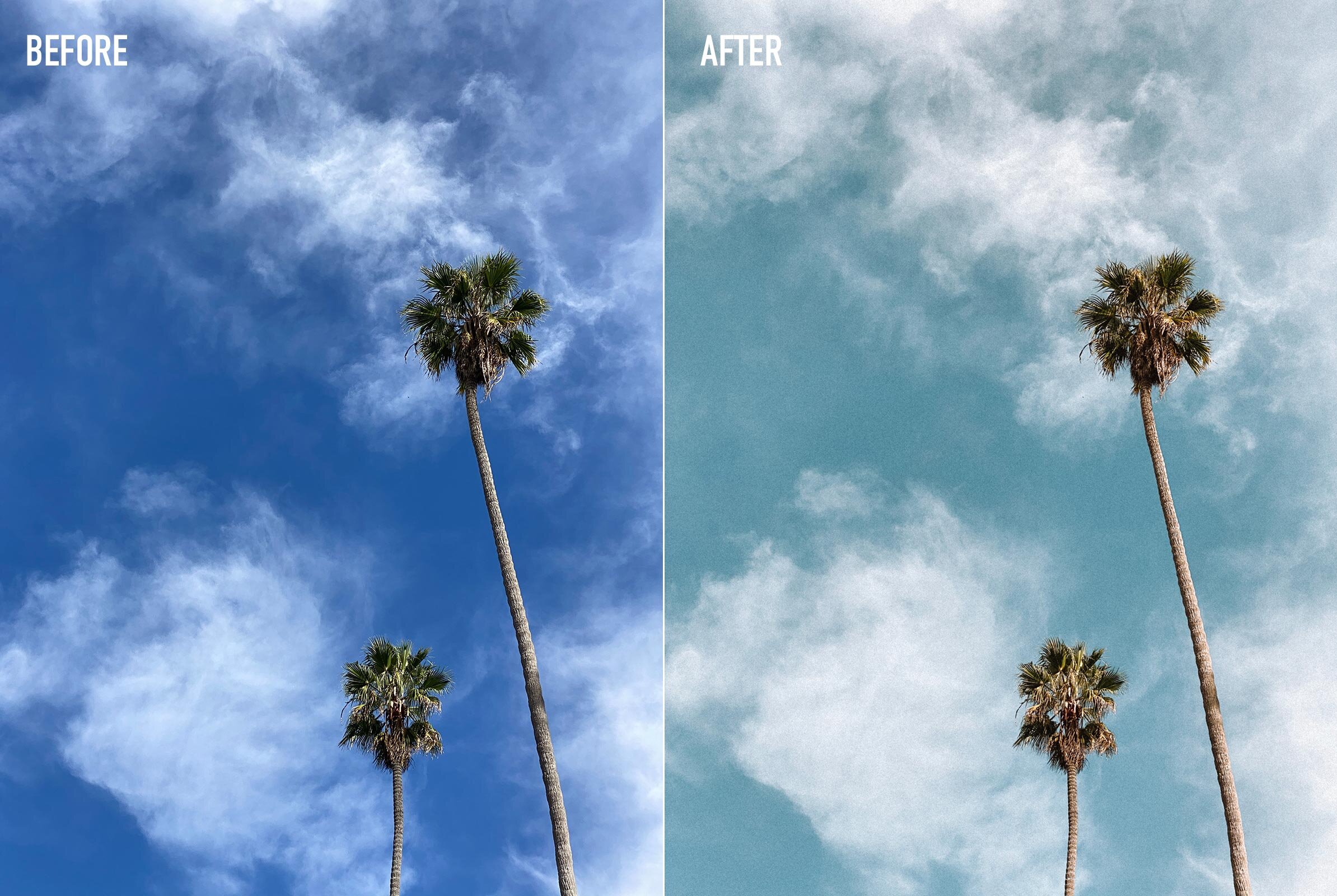
Credit: kellywirht.com
Frequently Asked Questions
How Do I Edit A Preset In Photoshop?
Open Photoshop and go to the Presets panel. Select the preset, adjust settings like color or effects, then save changes.
How Do I Change The Color Preset In Illustrator?
Open the Color Library menu in Illustrator. Select color groups, document swatches, or preset themes. Use the Color Theme Picker to sample and apply colors to artwork.
How Do I Edit Screen Color Settings?
Open Settings, go to System > Display > Color profile. Select your display and enable “Automatically manage color for apps” to edit screen color settings.
How To Edit Selective Color?
To edit selective color, adjust the hue, saturation, and luminance of specific colors using color adjustment tools. Use sliders to target and modify desired colors precisely.
How Do I Edit Preset Colors In Photoshop?
Open the preset panel, select the color preset, then adjust the color sliders to change it.
Can I Save Edited Preset Colors For Future Use?
Yes, save the changes as a new preset to reuse it anytime in your projects.
What Tools Help Me Change Preset Colors Easily?
Use color picker, sliders, or swatches in your editing software to modify preset colors quickly.
How To Reset Preset Colors To Default Settings?
Look for the reset option in the preset menu to restore original preset colors instantly.
Can I Edit Preset Colors On Mobile Apps?
Many mobile editing apps support preset color changes through simple sliders or preset editors.
Why Should I Customize Preset Colors?
Customizing presets helps match your unique style and improves consistency in your edits.
Conclusion
Editing preset colors allows you to personalize your designs quickly. Adjusting colors helps create the look you want. Small changes can make a big visual difference. Practice editing presets to improve your skills over time. Keep presets organized for easy access later.
Experiment with colors to find what suits your style best. Remember, simple steps lead to great results. Stay creative and enjoy the editing process.