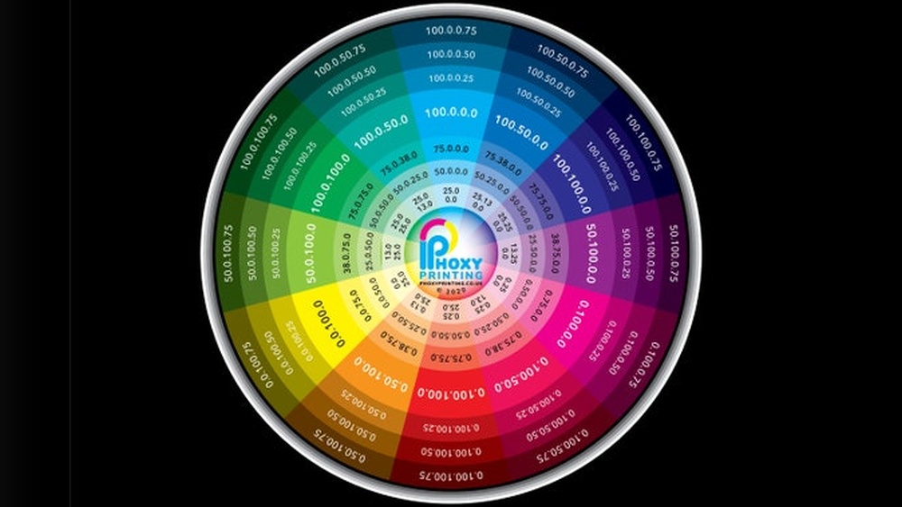
If you love working with colors, having your own color swatch charts can make a huge difference in your creative projects. Imagine being able to see exactly how each shade looks on paper before you start—no more guesswork or surprises.
Creating your own color swatch charts is simple, fun, and lets you organize your colors in a way that suits you best. In this guide, you’ll learn step-by-step how to make swatch charts that you can print and use anytime.
By the end, you’ll have a handy tool that saves time and helps you pick the perfect colors with confidence. Ready to master your colors like a pro? Let’s get started!
Choose Paper
Choosing the right paper is a key step in making your own color swatch charts. The paper affects how colors appear once printed or drawn. Picking the best paper helps show true color shades and details clearly.
Use paper that matches the material you use for coloring. This helps you see how colors will look in your actual work. For markers and colored pencils, thick cardstock or tag board gives the best results. These papers hold color well and prevent bleed-through.
Thin paper can cause colors to look dull or blurry. It may also wrinkle or tear easily when you add layers of color. Choose sturdy paper that supports multiple layers and blending.
Consider Paper Weight And Texture
Paper weight is measured in grams per square meter (gsm). A heavier paper feels thicker and stronger. For color swatches, aim for paper between 180 to 300 gsm. This weight balances durability and ease of use.
Texture impacts how color applies and shows. Smooth paper works well for fine details and sharp color edges. Rough or textured paper is better for softer blends and artistic effects. Pick texture based on your coloring style.
Match Paper To Your Medium
Colored pencils, markers, and watercolors all need different papers. Markers often work best on smooth, bleed-proof paper. Colored pencils need toothy paper that holds pigment well.
Watercolor paper is thicker and designed to handle wet media. Using the right paper for your medium keeps colors true and prevents damage. Test a small swatch first to check results.
Buy Quality Paper For Best Results
Invest in good quality paper to make your swatch charts last longer. Cheap paper can yellow over time or fade quickly. Quality paper preserves colors and looks professional.
Look for acid-free paper. It resists yellowing and keeps colors bright. Choose brands known for art or printing paper. This choice helps your chart stay useful for months or years.
Draw Grid Layout
Drawing a grid layout is a key step in making your own color swatch chart. It keeps your colors neat and easy to read. A well-structured grid makes comparing colors simple and clear.
The grid sets the foundation for your chart. It defines where each color will go and how much space each swatch gets. This helps keep the chart organized and professional-looking.
Choose The Right Paper Size
Start by picking the paper size for your chart. Common sizes are A4 or letter size. This size fits most printers and gives enough room for many swatches.
Make sure your paper is thick enough to handle your coloring tools. Cardstock or heavy paper works best for markers and colored pencils.
Measure And Mark The Grid
Use a ruler to measure the space for each color swatch. Mark small lines lightly with a pencil. These marks will guide you in drawing straight lines.
Decide how many rows and columns you need based on your total colors. Keep each box large enough to show the color well.
Draw Horizontal And Vertical Lines
Connect your pencil marks to draw straight horizontal and vertical lines. This forms the boxes for your color swatches. Use a fine-tip pen or marker for clean lines.
Make sure all lines are even and straight. A steady hand or a ruler will help keep the grid tidy.
Add Space For Color Names
Create extra space next to or below each swatch box. This area is for writing the color’s name or number. Labeling helps identify each color easily later.
Keep the label area small but clear. Use light pencil marks to plan this space before drawing final lines.
Add Titles
Adding clear titles to your color swatch charts helps keep them organized. Titles guide you through the colors quickly. They also make your charts look neat and professional.
Titles explain what each chart shows. They tell the brand, type, or color range. Without titles, it is hard to know which colors you are using or comparing.
Add A Main Title
Place a main title at the top of your chart. Use the brand name or the color set name. For example, “Prismacolor Premier Colored Pencils” or “Summer 2024 Palette.”
Use a bigger font or bold text to make the main title stand out. This helps you find the chart fast among others.
Label Each Color Swatch
Write the name or number of each color below or beside the swatch. This helps you identify each color easily. Use simple, clear handwriting or a clean font.
If your colors have numbers, include them. They help match colors to their official names or product codes.
Include Date Or Version
Add the date or version of your swatch chart. This is useful if you update or make new charts later. For example, “March 2024” or “Version 2.”
This small detail helps you track changes over time. It keeps your collection organized and current.

Credit: shop.zenartsupplies.co
Find Templates
Finding the right template is the first step in making your color swatch chart easy and neat. Templates give you a clear structure to place each color. They save time and help keep your chart organized.
Templates come in different styles. Some have simple boxes for colors, while others include space for names or numbers. Choosing a template that fits your needs makes the process smooth.
Where To Search For Templates
Many websites offer free or paid templates. Art supply sites often provide printable swatch charts. Design platforms also have customizable templates for color charts.
Templates For Different Supplies
Templates vary by the type of coloring tool. Some are made for markers, others for colored pencils or paints. Pick a template that matches your materials for best results.
Customizable Templates
Some templates let you add your own labels or change the grid size. This helps you fit all your colors neatly. Editable templates are useful for personalizing your chart.
Gather Supplies
Starting your own color swatch chart begins with gathering the right supplies. Each item plays a key role in creating clear and accurate swatches. Preparing well will save time and improve your results.
Choose quality materials that match your coloring tools. This helps to show true colors on your chart. Organize your supplies before you start to keep the process smooth and enjoyable.
Choose The Right Paper
Select paper similar to what you use for your artwork. Thick cardstock or tag board works best for markers and colored pencils. This paper holds color well and prevents bleeding. Using the right paper shows your colors clearly.
Collect Your Coloring Tools
Gather all colored pencils, markers, or paints you want to include. Check each tool to ensure it works well. Having all colors ready helps you swatch without interruptions. Group similar colors together for easy use.
Prepare Writing Materials
Use a fine-tip pen or pencil to label your swatches. Clear labels help identify each color easily. A ruler can help draw neat lines or grids. Keep an eraser handy for corrections.
Find Or Create A Template
Download a ready-made template or design your own grid. Each box should have space for a color swatch and its name. A clean layout makes your chart easy to read. Templates save time and keep your work organized.
Arrange Colors
Arranging colors on your swatch chart helps you see each shade clearly. A neat layout makes it easier to compare and select colors later. Thoughtful organization improves the chart’s usefulness for your projects.
Arrange Colors By Hue
Group colors by their basic hue, such as reds, blues, and greens. This creates a natural flow across the chart. It helps your eyes move smoothly from one color to the next.
Use A Gradient Or Rainbow Order
Arrange colors in a rainbow sequence from warm to cool tones. This order shows the full spectrum clearly. It also highlights subtle shifts between shades.
Organize By Color Family
Place similar colors together, like all blues or all yellows in one section. This makes it easier to compare shades within the same family. You can spot slight differences quickly.
Separate Light And Dark Shades
Arrange each color from lightest to darkest or vice versa. This shows the full range of each shade’s depth. It helps you choose the right tone for your work.
Label Each Swatch Clearly
Write the color name or number under each swatch. Clear labels avoid confusion later. They also help you keep track of your supplies.
Label Swatches
Labeling your color swatches is a key step in creating a useful chart. Clear labels help you identify each color quickly. This makes your chart practical and easy to use over time.
Labels should be neat and easy to read. Use consistent fonts or handwriting styles. Keep the size small but legible to fit well with each swatch.
Include Color Names And Numbers
Write the exact name of each color next to its swatch. If your colors come with numbers, add those too. This helps match colors to their official labels.
Color names and numbers avoid confusion. They make your chart a reliable reference tool.
Use A Clear And Simple Font
Choose fonts that are easy to read at a glance. Sans-serif fonts like Arial or Helvetica work well. Avoid fancy or cursive fonts that are hard to read.
Keep font size consistent. Around 10 to 12 points is usually ideal for labels.
Position Labels For Best Visibility
Place each label close to its color swatch. Most people put labels below or to the side of the swatch. Make sure labels do not overlap colors.
Maintain enough spacing to keep your chart clean. Proper spacing improves readability and overall appearance.
Credit: www.etsy.com
Swatch Techniques
Swatch techniques help you display colors clearly and accurately. These methods show how colors change with pressure or medium. Using simple steps, you can create useful swatch charts for printing.
Choose a technique based on your tools and the type of color effects you want. Each technique highlights different color properties. Below are two popular methods for making swatches.
Light To Dark Pressure
This technique uses varying pressure to show color intensity. Start by pressing lightly to apply a faint layer of color. Gradually increase pressure to create darker, richer tones. This method works best with pencils and crayons.
It helps you see the full range of a color from soft to bold. Swatching this way makes it easier to choose the right shade for your project. Always keep your strokes even and in the same direction.
Watercolor Method
The watercolor method shows how colors look when diluted with water. Begin with a full, solid color at one end of the swatch box. Slowly add water as you move across, lightening the color.
This gradient effect reveals the paint’s transparency and flow. It’s perfect for testing watercolor paints or inks. Use thick paper to avoid warping and let each swatch dry before labeling.
Drying And Checking
Drying and checking are crucial steps after applying your colors to the swatch chart. Colors can look different when wet versus dry. Waiting allows the true shade to appear. This process helps you avoid mistakes before printing or finalizing your chart.
Checking the dried swatches ensures color accuracy. Some colors may darken or lighten as they dry. Others might show unexpected undertones. Careful inspection saves time and materials later.
Letting Your Swatches Dry Completely
Allow each swatch to dry fully before touching or moving the paper. This prevents smudging and mixing of colors. Drying time depends on the medium used. Watercolors dry faster than markers or acrylics.
Place your chart on a flat surface in a dust-free area. Avoid stacking sheets until they are dry. A fan can speed drying but avoid direct heat or sunlight. These can alter the color or warp the paper.
Inspecting Color Changes After Drying
Look closely at each swatch under natural light. Artificial lighting can change how colors appear. Notice if the color looks lighter, darker, or duller. This helps you understand how your materials behave.
Use a magnifying glass if needed to check for texture or uneven application. Some pigments may separate or settle differently as they dry. Mark any colors that do not meet your expectations for future adjustments.
Correcting And Retesting Swatches
If a swatch does not dry as expected, try a second layer. Some colors need more than one application for true hue. Allow each layer to dry fully before adding the next.
Test these corrected swatches again after drying. Keep notes about which colors need extra coats or different pressure. This record helps you create perfect charts each time.
Store Charts
Storing your color swatch charts properly keeps them safe and easy to access. Neat storage protects the charts from damage and fading. It also helps maintain your color references for future projects.
Keeping charts organized saves time when choosing colors. Clear storage methods prevent loss or wrinkles. Consider the space available and how often you use the charts.
Use Clear Plastic Sleeves
Clear plastic sleeves protect charts from spills and dirt. They keep colors bright and paper flat. Use sleeves that fit the chart size perfectly. Store these sleeves in a binder for easy flipping.
Store In A Flat Box
A flat box prevents bending and folding. Choose one with a sturdy lid to avoid dust. Label the box to identify contents quickly. This method is ideal for large or multiple charts.
Keep Charts In A Portfolio Folder
Portfolio folders provide excellent protection and portability. They have pockets that keep charts separated. Use a folder with a zipper or snap closure. This setup makes carrying charts to different locations easy.
Use A Digital Backup
Take photos or scan your charts for digital copies. Store them on your computer or cloud storage. Digital backups are useful if the physical charts get damaged. They also allow sharing colors with others easily.

Credit: www.reddit.com
Frequently Asked Questions
How To Make A Color Swatch Sheet?
To make a color swatch sheet, prepare paper and draw a grid with spaces for swatches and labels. Organize colors by number or hue. Apply each color with varying pressure to show depth. Label each swatch clearly with its name or number for easy identification.
What Is The 60 30 10 Rule For Color Palettes?
The 60 30 10 rule balances color in design: 60% dominant, 30% secondary, and 10% accent colors. It creates harmony and visual interest.
How To Create Your Own Swatch?
To create your own swatch, start by drawing a grid on suitable paper. Arrange and label colors. Swatch each color using light to heavy pressure for full range.
How To Create A Personal Color Palette?
To create a personal color palette, choose colors that complement your skin tone and style. Test shades on your skin under natural light. Organize chosen colors by categories like neutrals, accents, and bolds. Use digital tools or physical swatches for easy reference.
Adjust palette as needed for harmony.
What Materials Do I Need To Make Color Swatch Charts?
You need paper, ruler, pens, colored pencils or markers, and a clean workspace.
How Do I Choose The Right Paper For Swatch Charts?
Use thick cardstock or tag board similar to your coloring paper for true color display.
What Is The Best Layout For A Color Swatch Chart?
Draw a grid with space for each color and a column for its name or number.
Should I Label Each Color On My Swatch Chart?
Yes, label each swatch clearly with its color name or number for easy reference.
Can I Use Digital Tools To Create Color Swatch Charts?
Yes, templates in programs like Canva help create neat and printable swatch charts.
How Do I Apply Colors On My Swatch Chart?
Swatch each color with light to dark strokes to show its full range and intensity.
Conclusion
Creating your own color swatch charts helps you see true color results. Use good paper and organize colors neatly for best results. Label each swatch clearly to avoid confusion later. This simple process saves time when choosing colors for projects.
Keep your chart updated as you add new supplies. Enjoy the ease of picking colors that match perfectly. Making charts yourself builds confidence in your color choices. Try it today and see how much it helps!