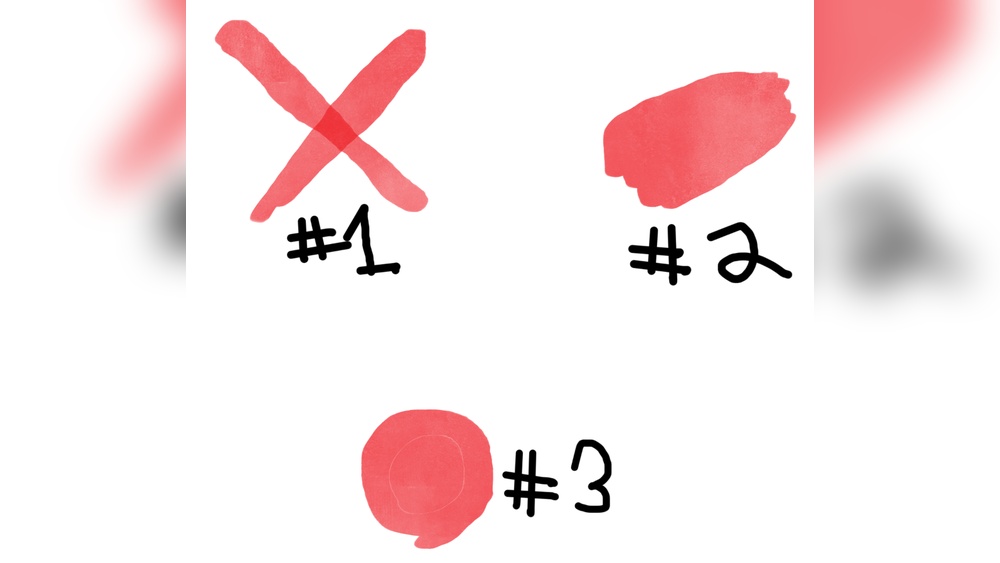
Are you tired of your colors looking uneven or patchy in ibis Paint? Getting your colors to stay consistent can completely transform your artwork and make your designs pop with professionalism.
Whether you’re shading, blending, or just filling in areas, mastering color consistency is key to creating smooth, eye-catching images. In this guide, you’ll discover simple, practical tips and tools within ibis Paint that will help you keep your colors uniform and vibrant every time you draw.
Keep reading, and you’ll learn how to make your colors work together seamlessly, so your art always looks polished and stunning.
Set A Consistent Color Palette
Setting a consistent color palette is key to making your artwork look unified and professional in Ibis Paint. It helps keep your colors balanced and avoids clashing tones. A consistent palette also saves time by limiting your choices to colors that work well together.
Start by choosing a base set of colors for your project. These should include main colors, shadows, highlights, and any accent colors. Stick to these colors throughout your drawing to maintain harmony.
Save Your Palette For Easy Access
Create and save your custom palette in Ibis Paint. This way, you can quickly pick the same colors without searching each time. Use the palette tool to add colors and keep them organized.
Use Color Codes For Precision
Note down the hex or RGB codes of your colors. Using exact codes ensures you reuse the same shades exactly. This method prevents slight color shifts that can happen when selecting colors by eye.
Limit The Number Of Colors
Stick to a small range of colors to avoid overwhelming your design. A limited palette helps keep your artwork clean and consistent. It also improves the mood and style of your piece.

Credit: tips.clip-studio.com
Use Color Balance Filters
Using color balance filters in ibis Paint helps keep your colors consistent across your artwork. These filters adjust the tones of your image by changing the balance of reds, greens, and blues. This makes your colors look more natural and uniform. You can fix colors that look too warm or cool by using these sliders. It is a simple way to improve your art without redrawing or repainting.
How To Access Color Balance Filters In Ibis Paint
First, open your artwork in ibis Paint. Tap on the Tool Selection window. Choose the Filter option. Then select Color Balance from the list. This will open sliders that control the color tones. Adjust these sliders to change the look of your image. When done, tap the checkmark to save your changes.
Adjusting The Sliders For Better Color Consistency
The sliders control the amount of red, green, and blue in your image. Move the red slider to add or remove red tones. Use the green slider to balance green shades. Adjust the blue slider to fix blue hues. Small changes can make a big difference. Take your time to find the right balance.
Tips For Using Color Balance Filters Effectively
Work in small steps to avoid overdoing it. Use the undo button if the colors look wrong. Compare the before and after views often. Try to match colors from different layers or parts of your drawing. This keeps your artwork looking consistent and polished.
Adjust Brightness And Contrast
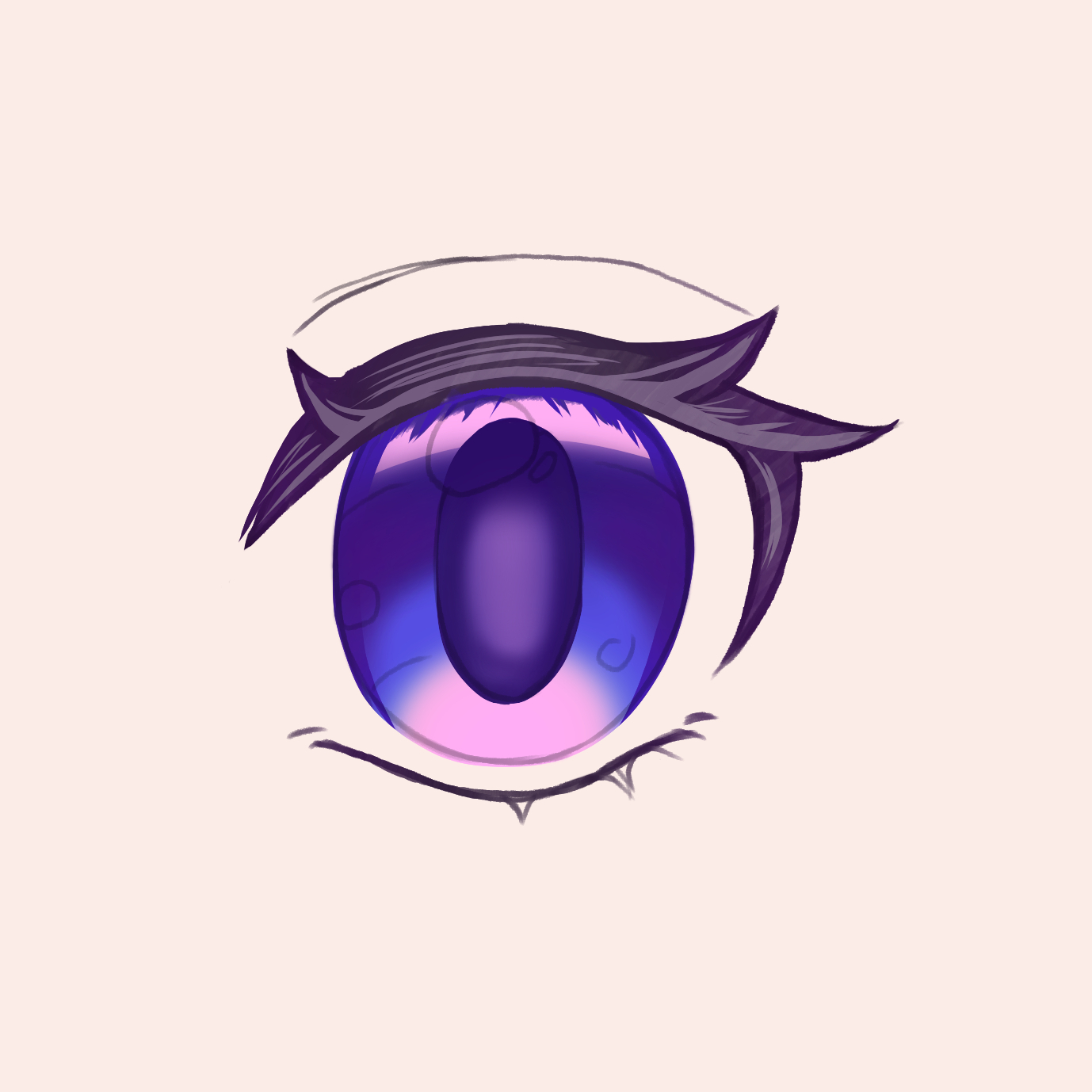
Adjusting brightness and contrast is a simple way to make your colors look consistent. It helps control how light or dark your colors appear. This adjustment can bring balance to your artwork. In Ibis Paint, you can easily tweak these settings to improve your image.
Changing brightness affects the overall lightness of your colors. Contrast changes the difference between dark and light areas. Both settings work together to enhance your color consistency.
How To Access Brightness And Contrast Settings
Open your image in Ibis Paint. Tap the “Filter” menu from the toolbar. Choose “Brightness/Contrast” from the list. This opens sliders for both options. You can now adjust them as needed.
Tips For Adjusting Brightness
Start by moving the brightness slider slowly. Increase brightness to lighten dull colors. Lower brightness to add depth to bright colors. Watch your colors carefully to avoid washing out details.
Tips For Adjusting Contrast
Increase contrast to make colors pop. It helps separate colors and adds sharpness. Decrease contrast for a softer, muted look. Find the right level to keep colors balanced.
Preview And Save Your Changes
Use the preview option to see adjustments before saving. Make small changes and compare with the original. Once satisfied, tap the checkmark to apply. Save your image to keep the consistent colors.
Credit: tips.clip-studio.com
Utilize Layers For Color Control
Using layers in Ibis Paint helps keep your colors clean and easy to adjust. Layers separate different parts of your artwork. This separation gives you more control over each color. It also stops colors from mixing unintentionally.
You can work on one color without changing others. This makes fixing mistakes faster and simpler. Layers let you try new colors safely. If a color does not look right, change it without starting over.
Organize Colors On Different Layers
Create a new layer for each main color or color group. This keeps your colors separate and easy to edit. Label layers clearly to find colors quickly. This method reduces confusion and speeds up your workflow.
Use Layer Modes To Adjust Colors
Layer modes like Multiply, Overlay, or Screen change how colors interact. Use these modes to add shadows or highlights without painting over base colors. This adds depth and keeps colors consistent across your drawing.
Lock Transparent Pixels For Precise Coloring
Locking transparent pixels stops you from coloring outside your shapes. Paint only on the colored area without affecting the empty parts. This feature helps keep edges sharp and colors neat.
Adjust Layer Opacity To Blend Colors Smoothly
Lower the opacity of a layer to make colors blend better. This softens harsh edges between colors. Adjust opacity to create smooth transitions and natural shading.
Use Clipping Masks For Targeted Color Changes
Clipping masks let you color inside the shape of the layer below. Change colors or add effects without painting outside boundaries. This keeps your artwork clean and professional.
Apply The Stabilizer For Clean Lines
Applying the stabilizer in ibis Paint helps create smooth, clean lines. This tool reduces shaky strokes and sharpens your artwork edges. Clean lines make your colors appear more consistent and polished. It gives control to your hand movements and improves overall drawing quality.
What Is The Stabilizer?
The stabilizer is a setting that smooths out your brush strokes. It slows down quick or uneven hand movements. This creates steady lines that look neat and clear. It is especially useful for detailed work and coloring inside shapes.
How To Adjust The Stabilizer
Find the stabilizer option in the brush settings menu. You can choose from different levels, such as low, medium, or high. Higher levels create smoother lines but may feel slower. Test each level to find what suits your style best.
Benefits Of Using The Stabilizer For Consistent Colors
Smooth lines prevent color from spilling outside borders. This keeps your color blocks clean and clear. When lines are steady, shading and blending become easier. Your final artwork looks more professional and vibrant.
Master Blending Techniques
Blending colors smoothly in ibisPaint helps keep your artwork consistent. It creates natural transitions between shades. This technique prevents harsh lines that break the flow of colors.
Using blending tools correctly brings harmony to your palette. It makes your colors appear more connected and realistic. Practice these methods to improve your digital painting skills.
Understanding The Blend Tool
The Blend Tool softens edges between different colors. Select it from the brush menu to start blending. Adjust the brush size for precise control. Use gentle strokes to merge colors without overmixing.
Layering And Opacity Control
Work with layers to blend colors effectively. Lower the opacity of your brush to build color gradually. This method prevents muddy colors and keeps your work clean. Use multiple layers to separate shadows, highlights, and base colors.
Using Smudge Brush For Smooth Transitions
The Smudge Brush pushes colors together, creating soft gradients. Set the strength low for subtle blending effects. Move the brush slowly to avoid unwanted distortions. This tool is perfect for skin tones and soft textures.
Experimenting With Color Mixing
Mix colors directly on the canvas for natural blends. Use complementary colors to add depth and interest. Try blending warm and cool tones for lively effects. This approach makes your colors feel more vibrant and alive.
Avoid Gaps When Filling Colors
Filling colors in Ibis Paint can sometimes leave small gaps along your lines. These gaps cause colors to spill outside the intended area or leave uncolored spots. Avoiding gaps helps keep your artwork neat and consistent. It ensures your colors fill smoothly without bleeding over edges.
Small gaps happen because of thin or broken line art. Filling tools detect boundaries to stop the fill, but gaps let the color leak out. Closing these gaps before filling saves time and frustration.
Check Your Line Art For Tiny Breaks
Zoom in on your drawing. Look closely along your lines for any breaks or thin spots. Even small breaks can cause gaps. Use the pen or brush tool to fix these gaps by redrawing the lines. Make sure the edges are solid and connected.
Use The Stabilizer To Draw Smooth Lines
The Stabilizer tool helps you draw smooth, clean lines. It reduces shakiness and prevents gaps. Turn it on before outlining your drawing. Smooth lines create a perfect boundary for the fill tool.
Increase The Fill Area Margin
Ibis Paint has a setting called “Area Margin” for the fill tool. Increasing this margin allows the fill to cover small gaps automatically. Adjust the margin higher if your fill escapes the lines. Test different values for best results.
Close Gaps Manually With The Brush Tool
If you still see gaps after filling, close them by hand. Select a small brush size and carefully paint over the breaks. This method ensures no color leaks out. It also keeps your artwork crisp and clean.
Save Custom Swatches
Saving custom swatches in ibisPaint helps keep your colors consistent across projects. This feature lets you store specific colors you like. You can reuse them anytime without searching again. It saves time and ensures your artwork looks uniform.
Using custom swatches also makes color matching easier. You avoid small color differences that can happen when picking colors manually. This simple step improves your art quality and speeds up your workflow.
How To Create Custom Swatches In Ibispaint
First, open the color picker in ibisPaint. Choose the color you want to save. Tap the “+” button near the swatches panel. Your chosen color will appear as a new swatch. Repeat this to add all your favorite colors.
Organizing Your Swatches For Easy Access
Group similar colors together in the swatch panel. Keep your main palette at the top for fast selection. Rename your swatch groups if needed. This helps find colors faster while working on complex projects.
How To Use Saved Swatches In New Projects
Open the swatch panel in any new canvas. Tap the saved color to select it. Use these colors directly for painting or filling. This keeps your color scheme consistent across different artworks.
Use Reference Images Effectively
Using reference images effectively helps keep your colors consistent in ibis Paint. Reference images give you a clear example of colors to match. This practice reduces guesswork and improves accuracy.
Study your reference images carefully before starting your artwork. Observe the color tones, shades, and lighting. This attention ensures your colors look natural and balanced.
Choose High-quality Reference Images
Select clear, sharp images with accurate colors. Low-quality images may have distorted or dull colors. Good images make it easier to pick the right colors in ibis Paint.
Use The Reference Image Layer
Import your reference image as a separate layer in ibis Paint. Keep it visible but unobtrusive. This setup allows you to compare your colors directly while drawing.
Sample Colors Directly From The Image
Use the eyedropper tool to pick colors from your reference image. Sampling colors saves time and helps maintain color harmony. It also prevents color mismatches.
Adjust Colors For Lighting And Mood
Reference images show colors under specific lighting. Adjust your colors slightly to fit your artwork’s mood or style. Small tweaks create a more cohesive look.

Credit: thespraysource.com
Regularly Calibrate Your Screen
Colors on your screen may look different from what others see. This difference happens because screens can lose color accuracy over time. Regularly calibrating your screen helps keep colors true and consistent. This step is key to creating artwork that looks right on all devices.
What Is Screen Calibration?
Screen calibration adjusts your monitor’s color settings. It balances brightness, contrast, and color tones. This process fixes color shifts caused by aging screens or poor settings. Calibration ensures the colors you pick in Ibis Paint are the colors you see.
How Often Should You Calibrate?
Calibrate your screen at least once a month. Frequent calibration keeps colors stable and reliable. If you work on color-sensitive projects daily, calibrate more often. Consistent calibration prevents surprises in your artwork’s final look.
Tools For Calibrating Your Screen
Use built-in software calibration tools on your computer. Windows and Mac have simple calibration wizards. For better results, consider a hardware calibrator. These devices measure colors precisely and adjust your monitor automatically.
Benefits Of Regular Calibration
Calibration improves color accuracy in Ibis Paint. It helps match your artwork colors to other screens and prints. This step reduces guesswork and saves editing time. Your colors stay vivid and true to your creative vision.
Frequently Asked Questions
How To Change Color Balance On Ibispaint?
Open the Tool Selection window, choose Filter, then select Color Balance. Drag the slider to adjust colors. Tap ✓ to apply changes.
Does Ibispaint Allow Nsfw?
IbisPaint lets you create NSFW art privately within the app. Uploading NSFW content to its online gallery is prohibited and may cause bans. Share NSFW work only on platforms that allow it and label it properly. Always follow each platform’s content rules.
How To Blend Colors Perfectly?
Use smooth, small strokes while gradually mixing colors. Adjust opacity and layer settings for seamless transitions. Practice patience and refine edges carefully.
How To Stabilize On Ibispaint?
To stabilize lines on ibisPaint, select the stabilizer tool. Adjust the slider to control line smoothness for cleaner strokes.
How Do I Maintain Color Consistency In Ibis Paint?
Use the same color palette and save your favorite colors in the palette for reuse.
Can I Use Color Codes For Exact Colors In Ibis Paint?
Yes, you can enter HEX or RGB color codes to get precise colors.
What Tool Helps Adjust Colors Evenly In Ibis Paint?
The Color Balance filter lets you fine-tune colors across your artwork.
How Do Layers Affect Color Consistency In Ibis Paint?
Keep colors on separate layers to adjust without affecting other parts.
Is Using The Eyedropper Tool Helpful For Color Consistency?
Yes, the eyedropper picks exact colors from your canvas for matching.
Can I Save Custom Palettes In Ibis Paint?
Yes, you can create and save custom color palettes for future projects.
Conclusion
Consistent colors improve your artwork’s look and feel. Use Ibis Paint’s tools like Color Balance and Layers. Adjust sliders slowly to get the right tone. Save your favorite palettes for future use. Practice helps you see better color harmony each time.
Keep experimenting to find what suits your style best. Consistency takes patience but gives great results. Enjoy creating with clearer, balanced colors every time.