How many paint colors should you use in a house interior? The answer depends on your style and preferences.
Choosing the right number of paint colors can transform your home’s look. Too many colors might overwhelm, while too few can seem dull. Balancing colors creates harmony and visual interest. In this blog post, we’ll explore how to find that perfect balance.
You’ll learn how to mix and match colors to suit different rooms. We’ll also share tips on using color to enhance your home’s design. Whether you prefer bold or subtle hues, this guide will help you make informed choices. Ready to add some color to your home? Let’s dive in!

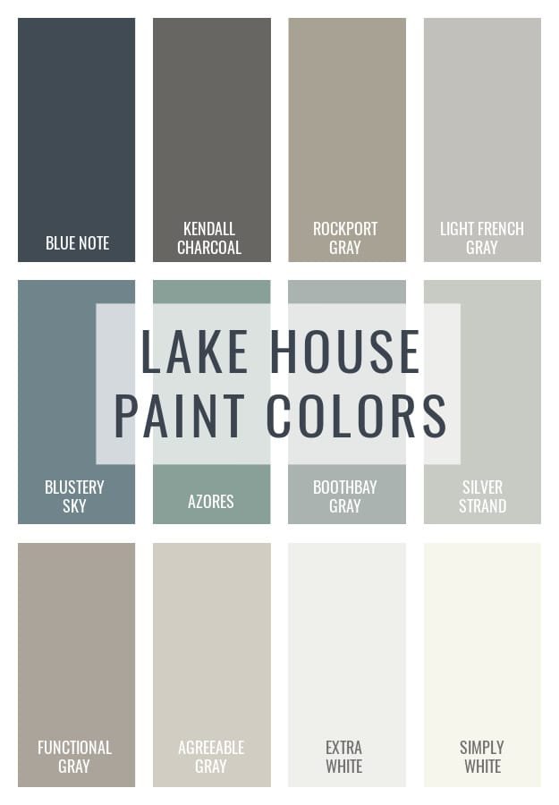
Credit: www.pinterest.com
Choosing A Color Palette
Choosing the right colors for your home can be exciting. It can also be overwhelming. The colors you choose set the mood for each room. A well-chosen palette can create harmony and flow throughout your home.
Finding Inspiration
Inspiration is everywhere. Start by looking at your favorite things. This can be a piece of art, a fabric, or even a photo. Nature is also a great source. Look at the colors in a beautiful landscape. You can find ideas in magazines and online platforms like Pinterest.
Here are some ways to find inspiration:
- Magazines: Home decor magazines are full of ideas.
- Online Resources: Websites and apps offer endless color schemes.
- Nature: Look at the colors in your garden or a local park.
- Existing Items: Match colors to your furniture or favorite piece of art.
Using Color Theory
Understanding color theory can help you choose the right palette. It involves the color wheel, which shows the relationship between colors. There are primary, secondary, and tertiary colors.
Here are some key points about color theory:
| Term | Definition |
|---|---|
| Primary Colors | Red, blue, and yellow. They cannot be made by mixing other colors. |
| Secondary Colors | Green, orange, and purple. Made by mixing primary colors. |
| Tertiary Colors | Colors made by mixing primary and secondary colors. |
Use these combinations to create different effects:
- Complementary Colors: Colors opposite each other on the wheel. They create contrast.
- Analogous Colors: Colors next to each other on the wheel. They create harmony.
- Monochromatic Colors: Different shades of one color. They create a cohesive look.
By using these tips, you can choose a color palette that fits your home. Take your time and enjoy the process!
Room-by-room Considerations
Choosing the right paint colors for your home’s interior can feel overwhelming. Each room has its own function and atmosphere. Therefore, considering these factors is crucial for a cohesive look. Here, we will look at room-by-room considerations.
Living Room Ideas
The living room is often a gathering place. It should feel welcoming and comfortable. Neutral colors work well for a calm and cozy feel. Shades like beige, gray, or soft white are popular choices. For a bold touch, consider a feature wall in a deep blue or rich green. These colors can add depth and interest without overpowering the room. Accent colors in furniture or decor can also enhance the overall look.
Kitchen Color Choices
The kitchen is the heart of the home. Bright, cheerful colors can make it more inviting. Light shades of yellow, soft green, or even a crisp white can open up the space. These colors reflect light and make the kitchen feel larger. For a modern touch, consider two-tone cabinets. You can use a darker color on the lower cabinets and a lighter one on the upper cabinets. This adds visual interest and keeps the kitchen looking fresh.
Balancing Bold And Neutral
Choosing the right balance between bold and neutral colors in your home can be a fun challenge. Bold colors can energize a room. Neutral tones bring calm and balance. When used together, they create a perfect harmony. Let’s explore how to achieve this balance.
Incorporating Accent Colors
Accent colors can make a big impact. They can be used to highlight specific areas. Think of a vibrant red chair in a beige room. Or a bright blue vase on a white table. These pops of color add interest and depth.
You can also use accent walls. Paint one wall in a bold color. Keep the other walls neutral. This creates a focal point. It draws the eye without overwhelming the space.
Creating Harmony
Harmony in colors is essential. Too many bold colors can feel chaotic. Too many neutrals can be dull. Mix bold and neutral colors wisely. Use bold colors for accessories. Think pillows, rugs, and artwork. Keep larger items neutral. This keeps the room balanced.
Consider the 60-30-10 rule. Use 60% of a dominant color, usually a neutral. Add 30% of a secondary color. This can be a bolder choice. Finish with 10% of an accent color. This creates a balanced and pleasing look.
Understanding Light And Space
Understanding light and space is crucial when choosing paint colors for a house interior. Different lighting and room sizes affect how colors appear. A color that looks great in one room might seem dull in another. Let’s explore how natural light and room size influence your paint choices.
Natural Light Impact
Natural light changes throughout the day. Morning light is soft and warm. Afternoon light is bright and intense. Evening light has a cool, calming effect. Paint colors react to these changes. A color that looks bright in the morning might look muted in the evening. Observe how light enters your rooms. South-facing rooms get more sunlight. North-facing rooms get less. East-facing rooms have morning light. West-facing rooms have afternoon light. Choose paint colors based on these light patterns. Lighter colors brighten up dark rooms. Darker colors can add coziness to bright rooms.
Room Size Influence
Room size plays a big role in color choice. Small rooms feel larger with light colors. Light colors reflect more light. This makes the room seem bigger. Dark colors in small rooms can make them feel cramped. Large rooms can handle darker colors. Dark colors add warmth and intimacy. They make large spaces feel cozy. Keep furniture and decor in mind. They also affect how colors look. Use contrasting colors to highlight features. Complementary colors create harmony and balance.
Trendy Vs. Timeless Colors
Choosing paint colors for your house interior can be overwhelming. Should you follow the latest trends or stick with timeless classics? Trendy colors can give your home a fresh, modern look. Timeless colors, on the other hand, offer a sense of elegance and longevity. Let’s explore both options to help you decide.
Current Trends
Current trends in paint colors often reflect the latest in design and fashion. Right now, muted tones like soft pinks, pale blues, and earthy greens are popular. These colors create a calm and serene atmosphere. Bold, dark hues like navy blue and charcoal gray are also trending. They add drama and sophistication to any room. Another popular trend is the use of two-tone walls. This can create visual interest and depth in your space.
Classic Choices
Classic paint colors never go out of style. Neutrals like beige, white, and gray are always a safe bet. They provide a clean and timeless backdrop that complements any decor. Soft pastels like light blue, blush, and mint green are also classic choices. They add a touch of color without overwhelming the space. Classic colors are versatile and can easily adapt to changing trends. They offer a timeless appeal that keeps your home looking fresh and elegant for years.
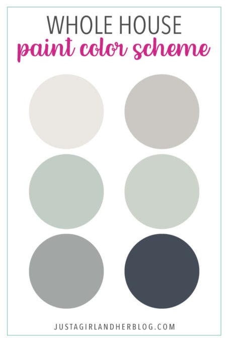
Credit: justagirlandherblog.com
Practical Tips For Application
Choosing the right paint colors for your house interior can be overwhelming. With so many options, it’s easy to feel lost. To help, we have practical tips for applying paint colors effectively in your home.
Test Swatches
Always test paint colors with swatches. Paint a small area on your wall. Observe how it looks in different lighting. Morning light can make colors look cool. Evening light can make them look warm. This helps in making the right choice. Avoid making decisions based on paint chips alone.
Avoiding Common Mistakes
Many people make common mistakes when choosing paint colors. One mistake is not considering the room’s purpose. Another mistake is using too many colors in one space. This can make the room feel chaotic. Stick to a few complementary colors. This creates a cohesive look.
Another mistake is ignoring the existing decor. Your furniture and flooring should match the paint colors. This ensures a harmonious design. Lastly, do not skip the primer. It helps the paint adhere better and last longer.
Integrating Personal Style
Choosing paint colors for your house interior can be exciting. It allows you to infuse your home with your unique taste. Paint colors reflect your personality and make your space truly yours. Below, we explore how personal style can guide your color choices.
Reflecting Personality
Your home is an extension of who you are. The colors you choose should reflect your personality. Bold and vibrant colors often indicate a lively and energetic nature. Soft and muted tones suggest a calm and serene character. Think about what colors make you feel at home. Choose shades that resonate with your inner self.
Family Preferences
Consider the preferences of all family members. Everyone should feel comfortable in their home. Discuss favorite colors and create a palette that pleases everyone. In shared spaces, balance individual tastes. You could use neutral tones and add pops of color through accessories. This way, each person’s style finds its place in the home.
Expert Recommendations
Choosing the right number of paint colors for your house interior can be tricky. Experts often share insights to help homeowners make the best choices. Below, we delve into professional opinions and real-life examples to guide you.
Professional Insights
Experts recommend using a maximum of three to five colors in a house interior. This ensures a cohesive look without overwhelming the senses. They suggest the following tips:
- Primary Color: Use for 60% of the space, usually the walls.
- Secondary Color: Covers 30% of the space, often for furniture and textiles.
- Accent Color: Use for 10% of the space, like pillows or artwork.
These guidelines keep the design balanced and harmonious. Experts also advise considering the home’s natural light and room size.
Case Studies
Real-life examples show how these recommendations work in practice. Let’s look at two case studies:
| Case Study | Description | Color Scheme |
|---|---|---|
| Modern Apartment | A couple used three colors: white, grey, and blue. White for walls, grey for furniture, and blue accents. |
|
| Family Home | A family chose five colors: beige, brown, green, yellow, and red. Beige for walls, brown for furniture, green and yellow for textiles, and red for art. |
|
These case studies illustrate the practical application of expert recommendations. They show how a thoughtful approach can create beautiful, livable spaces.

Credit: www.artisanbuilds.com
Frequently Asked Questions
How Many Paint Colors Should I Use In My House?
Using 3-5 paint colors in your house is ideal. This includes main and accent colors. It helps create a cohesive and stylish look.
What Is The Best Way To Choose Paint Colors?
Start with a favorite color or a piece of decor. Then, select complementary shades. Consider lighting and room function.
Should Each Room Have Different Paint Colors?
Each room can have different colors, but maintain harmony. Choose colors that complement each other throughout the house.
How Do Paint Colors Affect Room Size Perception?
Lighter colors make rooms appear larger and brighter. Darker colors can make a room feel cozy and intimate.
Conclusion
Choosing the right paint colors for your house interior can be enjoyable. Keep it simple and consider the mood you want in each room. Use a few complementary colors to create harmony. Don’t be afraid to experiment with shades and finishes.
Remember, your home reflects your personality. Happy painting!