
Finding the right number of paint colors for your house can be tricky. You want a balance that feels cohesive yet lively.
Deciding on paint colors for your home is more than just picking shades you like. It’s about creating a harmonious flow from room to room. Too few colors can make your space feel dull and monotonous. Too many can seem chaotic and overwhelming.
The goal is to find a sweet spot that reflects your style and enhances your home’s atmosphere. In this post, we will explore tips and guidelines to help you determine the ideal number of paint colors for your house. Let’s dive in and make your home both beautiful and inviting!

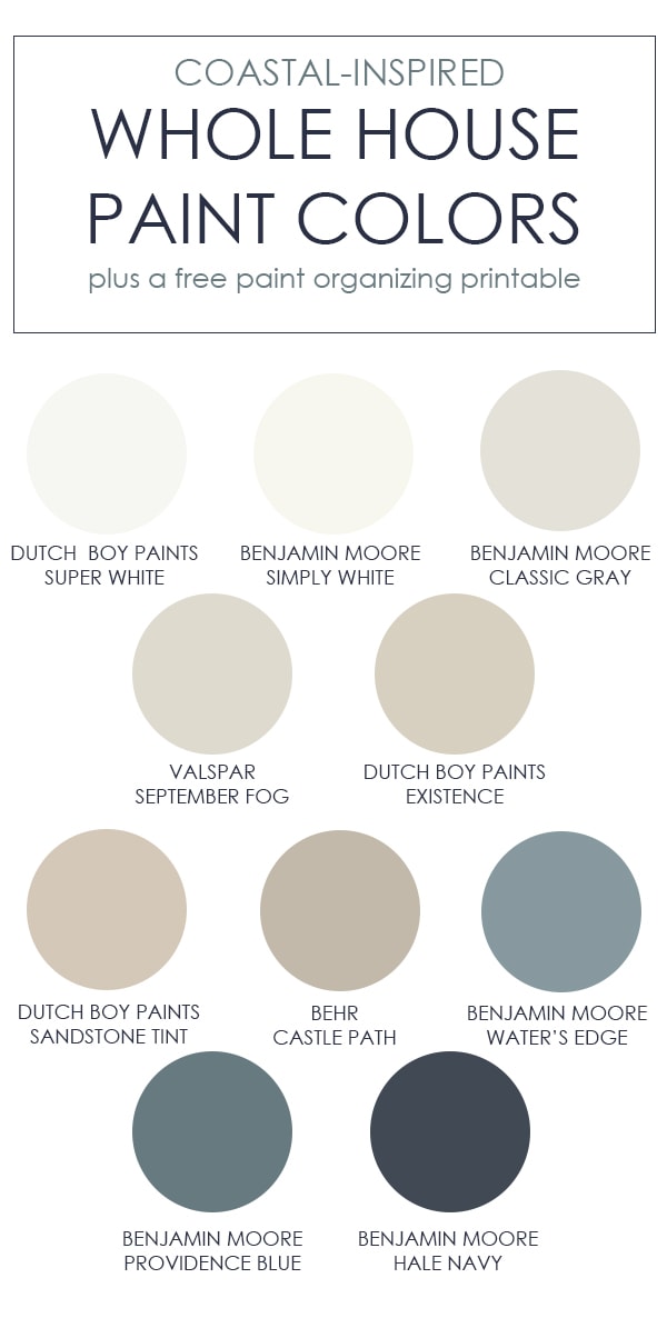
Credit: thistlewoodfarms.com
Choosing The Right Paint Colors
Choosing the right paint colors can transform your house into a cozy home. The right colors set the mood and enhance the overall look. But how many paint colors should you use in your house? Let’s dive into some factors to consider and popular color trends.
Factors To Consider
Several factors can influence your choice of paint colors. These include the size of your rooms, the amount of natural light, and your personal style. Small rooms may feel bigger with light colors. Larger rooms can handle darker shades. Natural light can change how colors appear during the day. Personal style is crucial. Choose colors that make you happy and comfortable.
Popular Color Trends
Neutral colors remain a favorite for many homeowners. These colors include shades of white, beige, and gray. They offer a timeless look and suit various decor styles. Bold colors are also trending. Vibrant blues, greens, and even blacks create striking statements. Pastel colors are making a comeback too. Soft pinks, blues, and greens add a gentle touch to any room.
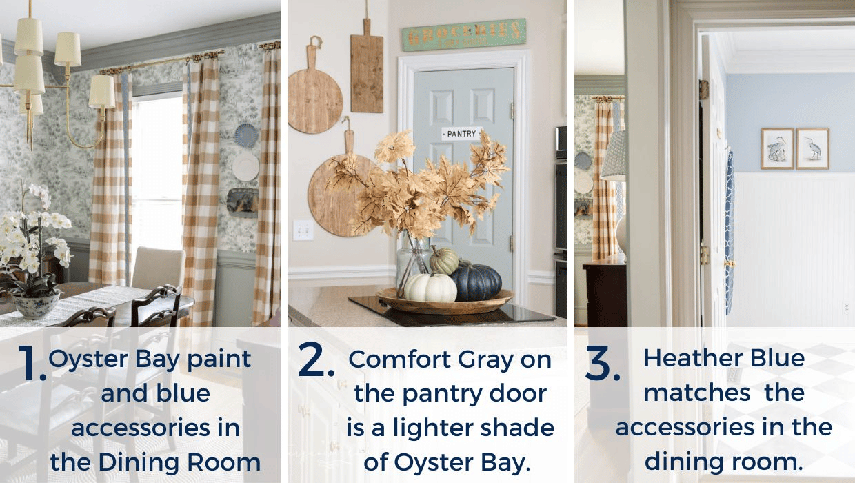
Credit: lifeonvirginiastreet.com
Creating A Color Scheme
Creating a color scheme for your home is essential. It sets the tone and mood for each room. A well-thought-out color scheme can make your home feel cohesive and inviting. Here, we’ll explore two popular color schemes: Monochromatic and Complementary.
Monochromatic Scheme
A monochromatic scheme uses different shades of a single color. This approach creates a clean and harmonious look. It’s perfect for those who love simplicity and elegance.
- Choose a base color.
- Select lighter and darker shades of that color.
- Mix in various textures to add depth.
For instance, if you choose blue, you could use light blue for the walls, navy for the furniture, and sky blue for accents. This scheme is soothing and visually pleasing.
Complementary Scheme
A complementary scheme involves using colors that are opposite each other on the color wheel. This creates a vibrant and dynamic look. It’s ideal for those who want a bold and lively atmosphere.
| Color | Complement |
|---|---|
| Red | Green |
| Blue | Orange |
| Yellow | Purple |
For example, pairing blue with orange can bring energy to a room. Use blue for the walls and orange for the decor. This scheme adds contrast and excitement to your space.
Choosing the right color scheme can transform your home. Whether you prefer the calm of a monochromatic scheme or the boldness of a complementary scheme, the key is to find what best suits your style and personality.
Room-by-room Color Guide
Choosing the right paint colors for your house can be exciting and overwhelming. A Room-by-Room Color Guide helps you select the best hues for each space. Each room serves a unique purpose. So, the colors should reflect its function and mood. Here’s a simple guide to help you decide.
Living Room Ideas
The living room is a central space. It is where you entertain guests and spend family time. Neutral colors like beige or gray work well. They create a calm and welcoming atmosphere. Accent walls in bold colors like navy or forest green can add depth. Light colors make a small living room appear larger. Dark shades make a large room feel cozier.
Bedroom Suggestions
Bedrooms are personal sanctuaries. Soft, calming colors like pastel blue, lavender, or soft green are ideal. They promote relaxation and rest. Earth tones like warm browns and tans offer a cozy feel. Avoid overly bright colors. They can be too stimulating. Balance is key. You can add pops of color through decor items like pillows or artwork.
Impact Of Lighting On Paint Colors
Lighting plays a crucial role in how paint colors appear in your home. The type of light, whether natural or artificial, can change the look and feel of a room. Understanding this impact helps in choosing the right paint colors for different spaces.
Natural Light Effects
Natural light changes throughout the day. Morning light is soft and warm, while midday light is bright and clear. Afternoon light becomes warmer again. Each of these phases affects paint colors differently. For instance, a light blue paint may look crisp in the morning but appear washed out in the afternoon.
Rooms facing north receive cooler, bluish light. This can make warm colors appear muted. South-facing rooms get more direct sunlight, making colors look more vibrant. East-facing rooms have warm, yellow light in the morning. West-facing rooms enjoy warm light in the evening.
| Room Orientation | Natural Light Description | Paint Color Impact |
|---|---|---|
| North-facing | Cool, bluish light | Warm colors appear muted |
| South-facing | Direct sunlight | Colors look more vibrant |
| East-facing | Warm, yellow morning light | Colors look bright in the morning |
| West-facing | Warm evening light | Colors look warm in the evening |
Artificial Light Considerations
Artificial lighting also affects paint colors. Different types of bulbs emit different shades of light. Incandescent bulbs give off a warm, yellow light. This can make reds and oranges look richer. Fluorescent lights emit a cooler, bluish light. They can make colors appear harsher and more clinical.
LED lights come in various color temperatures. Warm white LEDs mimic incandescent light. Cool white LEDs are similar to daylight. This variety allows more control over how colors look under artificial lighting.
- Incandescent bulbs: Warm, yellow light; enhances warm colors.
- Fluorescent lights: Cool, bluish light; can make colors look harsh.
- LED lights: Available in warm and cool options; offers more control.
Using Accent Walls
Accent walls can transform your space. They add depth and character to any room. By painting one wall a different color, you can highlight a specific area. This technique can create a focal point in your home. Let’s explore how to use accent walls effectively.
Choosing The Right Wall
Selecting the right wall for your accent is crucial. Pick a wall that stands out naturally. It could be the wall behind your bed or sofa. Avoid walls with large windows or doors. They can break the visual impact of the accent.
Consider the room’s layout. A solid wall works best. It should be the first wall you see when entering the room. This enhances the accent’s effect.
Color Selection Tips
Choosing the right color is key. Opt for colors that complement the room’s theme. Bold colors like red or blue can make a statement. Soft colors like pastel green or blush pink add a subtle touch.
Use a color wheel for guidance. Complementary colors can create a balanced look. Test the colors on a small area first. Ensure they match your vision.
Consider the room’s lighting. Natural light affects how colors appear. Bright colors work well in well-lit rooms. Darker shades suit dimly lit spaces.
Balancing Bold And Neutral Colors
Choosing paint colors for your house is an exciting task. It involves a delicate balance between bold and neutral colors. This balance can create a harmonious and visually appealing home. The key is to understand how to combine these colors effectively. It will help you achieve a cohesive look in your spaces.
Combining Bold Colors
Bold colors can add drama and character to your rooms. They work well in areas where you want to make a statement. For instance, a vibrant red accent wall in the living room can draw attention. Pair bold colors with softer tones to avoid overwhelming the space. Use bold colors in smaller doses to maintain balance. This way, they pop without dominating the room.
Another idea is to use bold colors in accessories. Think of cushions, rugs, or artwork. These can be easily swapped if you wish to change the look. Mixing bold colors with patterns can add depth. It can make your space feel dynamic and lively. Just remember to keep the rest of the room neutral.
Using Neutrals Effectively
Neutral colors are the backbone of any balanced color scheme. They create a calming and timeless backdrop. Neutrals like beige, gray, and white can make rooms feel spacious. They also allow bold colors to shine without clashing. Using a variety of neutral shades can add subtle sophistication.
Layering different neutrals can prevent your space from feeling flat. For example, a light gray wall with darker gray furniture can create depth. Neutrals also work well with natural textures. Think wood, stone, and metal. These elements can add warmth and interest to neutral spaces.
Using neutrals on large surfaces like walls and floors creates a versatile base. It allows you to play with bolder accents in your decor. This approach keeps the overall look balanced and cohesive. It also makes it easier to change your color scheme in the future.
Paint Finishes And Their Effects
Choosing the right paint finish is as important as the color. Each finish affects the look and feel of your rooms. Some finishes are durable, while others are best for hiding flaws. Knowing the effects of different finishes helps create the perfect ambiance in your home.
Matte Vs. Glossy
Matte finishes are flat and non-reflective. They hide wall imperfections well. Ideal for low-traffic areas like bedrooms or ceilings. Glossy finishes are shiny and reflective. They make colors pop and are easy to clean. Best for high-traffic areas like kitchens or bathrooms.
Satin And Eggshell Finishes
Satin finishes offer a soft sheen. They are durable and easy to clean. Suitable for family rooms and hallways. Eggshell finishes have a slight luster. They hide small imperfections better than satin. Great for living rooms and dining areas.
Expert Tips For Painting Your House
Choosing the right paint colors for your house can be challenging. With so many options available, it’s easy to feel overwhelmed. To make this process easier, we’ve gathered some expert tips. Follow these to create a beautiful and cohesive look for your home.
Preparation Steps
Preparation is key for a successful paint job. Follow these steps to ensure a smooth process:
- Clean the walls to remove dirt and grime.
- Repair any cracks or holes in the walls.
- Use painter’s tape to protect trim and edges.
- Cover furniture and floors with drop cloths.
- Prime the walls if needed.
Proper preparation ensures that the paint adheres well and lasts longer. It also helps in achieving a smooth and professional finish.
Common Mistakes To Avoid
Avoid these common mistakes to ensure a perfect paint job:
- Skipping the primer: Primer helps the paint stick better and look smoother.
- Choosing the wrong finish: Different rooms need different paint finishes. Use satin or eggshell finishes for living rooms. For bathrooms, use semi-gloss or gloss.
- Not testing colors: Paint small sections first. Check how the color looks in different lights.
- Ignoring the weather: Paint in good weather. Avoid painting in high humidity or rain.
- Rushing the process: Take your time. Let each coat dry properly before applying the next one.
By avoiding these mistakes, you can ensure a beautiful and lasting paint job for your home. Remember, patience and attention to detail are key to a successful painting project.
Credit: theturquoisehome.com
Frequently Asked Questions
How Many Paint Colors Should A House Have?
A house typically has 3 to 5 main paint colors. This includes primary, secondary, and accent colors. It creates a balanced look.
Can A House Have Too Many Paint Colors?
Yes, too many paint colors can overwhelm the space. Stick to a cohesive palette to maintain harmony.
What Are The Best Paint Colors For A Living Room?
Neutral tones like beige, gray, and white are popular. They create a calm and versatile living space.
How Do I Choose Exterior Paint Colors?
Consider your home’s architecture and surroundings. Test samples before making a final decision. Ensure colors complement each other.
Conclusion
Choosing the right number of paint colors can transform your home. Stick to a balanced palette for a cohesive look. Too many colors may overwhelm, while too few might feel dull. Experiment with shades and accents. Every room can have its own vibe.
Make your home inviting and stylish with thoughtful color choices. Keep it simple. Enjoy the process and trust your instincts. Your home should reflect your style and personality.