
Choosing the right acrylic paint colors can feel overwhelming. With so many options, where do you start?
Acrylic paints are a favorite for many artists. They’re versatile, easy to use, and dry quickly. But deciding which colors to buy first can be tricky. You want to have a range of colors that work well together. Having a good selection helps you create vibrant and realistic art.
In this guide, we will explore essential acrylic paint colors. We’ll help you build a basic, yet effective palette. Let’s dive into the world of colors and see which ones you should start with.
Introduction To Acrylic Paints
Acrylic paints are popular among artists. They are versatile and easy to use. If you are new to painting, acrylics are a great choice. They dry quickly and can be mixed with water. This makes them perfect for beginners and experienced artists alike.
Why Choose Acrylics
Acrylic paints have many benefits. They dry fast, which allows for quicker painting. You can layer colors without waiting long. They are also water-based, so cleaning brushes is easy. Plus, acrylics are non-toxic, making them safe for all ages.
Basic Characteristics
Acrylic paints are known for their vibrant colors. They maintain their brightness even after drying. These paints are also flexible. You can use them on various surfaces like canvas, paper, and wood. Another great feature is their durability. Once dry, acrylics are water-resistant. This ensures your artwork lasts longer.
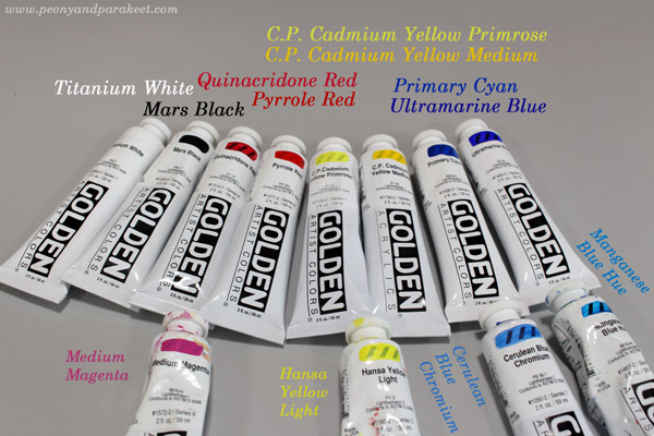
Credit: www.peonyandparakeet.com
Primary Colors
Understanding the primary colors is crucial for any artist. These colors are the foundation of the color wheel. By mixing primary colors, you can create a wide range of hues. The three primary colors in the world of acrylic paints are red, blue, and yellow.
Red
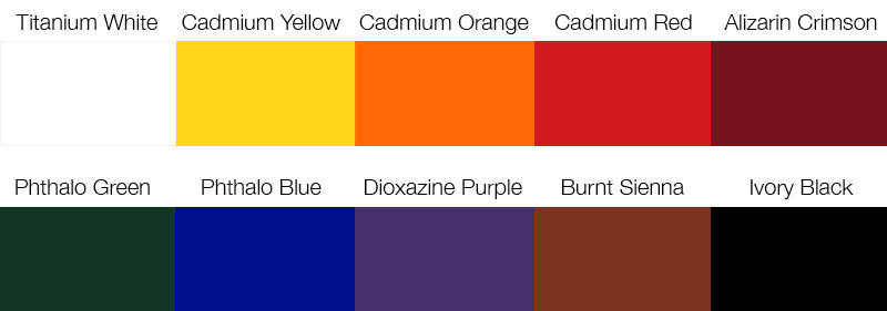
Red is a powerful and warm color. It can evoke emotions and draw attention. Cadmium Red is a popular choice for its vibrant and strong pigment. Another option is Alizarin Crimson, which is a bit more subdued but still rich in tone. These two reds can cover a broad range of shades.
Blue
Blue is versatile and can range from cool to warm tones. Ultramarine Blue is deep and intense, perfect for skies and seas. Phthalo Blue is another excellent option, offering a more vivid and slightly greenish hue. These blues can blend well with other colors to create various shades.
Yellow
Yellow brings brightness and energy to your palette. Cadmium Yellow is a strong, warm yellow that is very opaque. Lemon Yellow is lighter and more transparent, giving a cooler tone. These yellows can be mixed to create a wide range of greens and oranges.
Secondary Colors
When diving into acrylic painting, understanding secondary colors is crucial. These colors are created by mixing primary colors. They can add depth and excitement to your artwork. Let’s explore the three main secondary colors: orange, green, and purple.
Orange
Orange is a vibrant and warm color. It is made by mixing red and yellow. Orange can create energy in your paintings. It works well in sunsets, autumn scenes, and lively abstracts. Consider adding a tube of orange to your palette. It will help you achieve a wide range of effects.
Green
Green is a versatile and calming color. It is created by mixing blue and yellow. Green is essential for painting landscapes, plants, and nature scenes. From bright lime greens to deep forest greens, this color can bring your paintings to life. Make sure you have a variety of greens in your collection.
Purple
Purple is a rich and mysterious color. It is made by mixing red and blue. Purple can add drama and depth to your artwork. It is perfect for creating shadows, night skies, and mystical scenes. Having a good range of purples will enhance your palette’s versatility.
Neutral Colors
Neutral colors are essential for any artist’s palette. They provide balance, depth, and versatility. These colors can tone down bright hues, create shadows, and add highlights. Including black, white, and gray in your collection will give you endless possibilities.
Black
Black is a powerful color. It creates depth and contrast in your paintings. Use it sparingly to avoid overpowering your artwork. It’s excellent for shadows and outlining. A small amount of black can darken other colors without changing their nature.
White
White is a must-have for any artist. It lightens other colors and creates highlights. White can make your colors look soft and pastel-like. It is also great for mixing and creating new shades. Always have plenty of white on hand.
Gray
Gray is a versatile neutral color. It is perfect for creating subtle shadows and mid-tones. Gray can be mixed with other colors to create more muted tones. It is also great for backgrounds and adding depth without using black.
Earth Tones
Choosing the right acrylic paint colors can be overwhelming. Earth tones provide a versatile palette, ideal for creating natural and organic artworks. These colors mimic the hues found in nature, bringing warmth and realism to your paintings. Let’s explore some essential earth tones you should consider.
Brown
Brown is a fundamental earth tone. It adds depth and richness to your artwork. Brown shades can range from warm to cool, allowing for diverse applications. Here’s a quick guide to common brown shades:
| Shade | Description |
|---|---|
| Burnt Umber | Dark brown with a reddish hue |
| Raw Umber | Dark, yellowish-brown |
| Van Dyke Brown | Deep, warm brown |
Ochre
Ochre is a warm, earthy color derived from natural clay. It comes in various shades, from yellow to red. Ochre is perfect for landscapes and underpainting. Here are some common ochre shades:
- Yellow Ochre: Warm, golden yellow
- Red Ochre: Deep, rusty red
- Brown Ochre: Muted, warm brown
Sienna
Sienna is a versatile earth tone. It is available in two primary shades: raw and burnt. Raw Sienna is lighter and more yellowish, while Burnt Sienna has a rich, reddish-brown hue. These shades are essential for creating realistic shadows and textures.
- Raw Sienna: Light, yellow-brown
- Burnt Sienna: Warm, reddish-brown
Using these earth tones can help you achieve a natural and cohesive look in your art. They are perfect for beginners and experienced artists alike.
Credit: www.art-is-fun.com
Specialty Colors
Specialty colors can add a unique touch to your acrylic painting projects. These colors go beyond the basic palette and can make your artwork stand out. They include metallics, neon, and pastels. Let’s explore each one in detail.
Metallics
Metallic acrylic paints bring a shiny, reflective finish to your art. They can mimic the look of gold, silver, bronze, or copper. These paints are perfect for adding highlights or creating a luxurious feel.
- Gold
- Silver
- Bronze
- Copper
Use metallics for accents or to make specific areas pop. They work well on dark backgrounds. Experiment with different techniques to see the best results.
Neon
Neon acrylic paints are vibrant and eye-catching. They glow under black light, adding an exciting twist to your paintings. Neons are great for modern or abstract art.
- Neon Green
- Neon Pink
- Neon Orange
- Neon Yellow
These colors can be used for highlighting or to create a focal point. Be mindful of their strong presence; sometimes, less is more.
Pastels
Pastel acrylic paints offer a soft, soothing color palette. They are excellent for creating a calm and gentle atmosphere in your artwork.
- Baby Blue
- Soft Pink
- Lavender
- Mint Green
Pastels are ideal for landscapes, portraits, and floral paintings. They mix well with other colors and can create beautiful gradients.
Adding these specialty colors to your collection can enhance your creativity. Experiment and find out which ones work best for your style.
Mixing Colors
Mixing colors is an essential skill for any artist. It allows you to create a wide range of hues from a limited palette. Understanding the basics of color mixing can help you achieve the perfect shade or tint for your artwork. Let’s explore the fundamentals of mixing colors with acrylic paints.
Color Wheel Basics
The color wheel is a visual tool that illustrates the relationship between colors. It is divided into primary, secondary, and tertiary colors.
- Primary Colors: Red, blue, and yellow. These colors cannot be mixed from other colors.
- Secondary Colors: Orange, green, and purple. These are created by mixing two primary colors.
- Tertiary Colors: Colors formed by mixing a primary and a secondary color, such as red-orange or blue-green.
Using the color wheel can guide you in creating harmonious color schemes.
Creating Shades And Tints
Shades and tints add depth and dimension to your artwork. They are created by adding black or white to a base color.
| Term | Description | Example |
|---|---|---|
| Shade | Adding black to a color | Blue + Black = Dark Blue |
| Tint | Adding white to a color | Red + White = Pink |
Experiment with different amounts of black or white to find the perfect shade or tint for your project.
Remember to mix your colors thoroughly to avoid streaks. Practice makes perfect, so keep experimenting to discover new and exciting hues.
Building Your Palette
Building your palette is an essential step for any aspiring artist. A well-rounded palette allows you to express your creativity fully. Choosing the right acrylic paint colors can be overwhelming. Let’s break it down into manageable steps.
Starter Set
A starter set should include primary colors. Red, blue, and yellow are must-haves. These colors can mix to create a wide range of hues. Add black and white for shading and tinting. Green, brown, and a neutral gray are also useful. These basics will give you a solid foundation.
Look for good quality paints. They should have strong pigmentation and smooth consistency. This ensures vibrant and lasting colors on your canvas. You don’t need to buy the most expensive brands. Many affordable options provide excellent quality.
Expanding Options
Once you have a starter set, consider adding more colors. Try different shades of primary colors. For example, add a warm red like crimson and a cool blue like cerulean. These variations help create depth in your artwork.
Experiment with secondary colors too. Think about adding colors like purple, orange, and teal. These can make your paintings more dynamic. Metallic and fluorescent colors can also add interesting effects. Don’t be afraid to play around and find what works for you.
Remember, building your palette is a personal journey. Choose colors that resonate with your style. Over time, you will develop a unique set of colors that defines your work.
Tips For Choosing Quality Paints
Choosing quality acrylic paints can make a huge difference in your artwork. High-quality paints ensure vibrant colors and smooth application. Here are some tips to help you select the best acrylic paints for your needs.
Brand Recommendations
Several brands are known for their high-quality acrylic paints. Golden Acrylics is a top choice among artists for its rich pigments and smooth texture. Liquitex offers a wide range of colors and is great for both beginners and professionals. Winsor & Newton is another reliable brand with a long history of producing high-quality paints.
Budget-friendly Options
If you are on a budget, there are still excellent options. Blick Studio Acrylics provides good quality at a lower price. Artist’s Loft is another affordable brand that offers decent quality for beginners. Reeves acrylic paints are also budget-friendly and suitable for various projects.

Credit: www.reddit.com
Frequently Asked Questions
What Are The Basic Acrylic Paint Colors To Buy?
Start with primary colors: red, blue, and yellow. Add black, white, and a neutral like brown. These six colors can be mixed to create a wide range of hues.
What Brands Offer Quality Acrylic Paints?
Top brands include Liquitex, Golden, and Winsor & Newton. These brands are known for their quality pigments, consistency, and durability.
Should I Buy Student Or Artist Grade Acrylics?
Artist grade acrylics offer better pigmentation and coverage. Student grade acrylics are budget-friendly but may lack the vibrancy and consistency of artist grade.
What Are The Best Acrylic Paints For Beginners?
For beginners, Liquitex Basics and Winsor & Newton Galeria are excellent choices. They offer good quality at an affordable price.
Conclusion
Choosing the right acrylic paint colors is essential for any artist. Start with primary colors. Then, add some secondary colors and earth tones. This gives you a versatile palette. Experimenting with different shades can enhance your artwork. Remember, quality over quantity.
A few good colors can go a long way. Happy painting!