If you want your digital art to look truly lifelike, mastering realistic coloring in Adobe Fresco is key. Imagine bringing your drawings to life with smooth gradients, natural shadows, and vibrant tones that jump off the screen.
You might feel overwhelmed by all the tools and options, but what if you could learn simple, proven techniques that make coloring easy and enjoyable? You’ll discover step-by-step methods to create stunning, realistic colors that enhance every detail of your artwork.
Ready to transform your digital paintings and impress everyone with your skills? Let’s dive in and unlock the secrets of coloring realistic in Adobe Fresco.
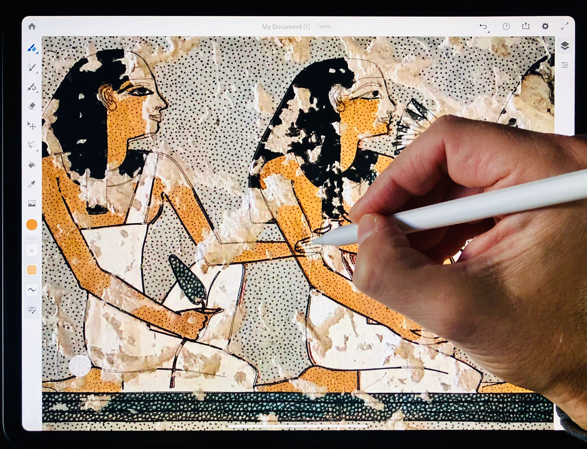
Credit: www.digital-epigraphy.com
Choosing Colors
Choosing the right colors is key to making your artwork look realistic in Adobe Fresco. Colors set the mood and define the form of your drawing. Picking colors carefully helps create depth and natural tones. Adobe Fresco offers tools that make color selection easy and precise. Understanding how to use these tools improves your coloring skills.
Using The Color Wheel
The color wheel in Adobe Fresco is a simple way to find colors. It displays a circle of hues arranged by their shade. You can tap or drag around the wheel to pick a base color. The wheel helps you see how colors relate to each other. Choose colors close together for harmony or opposite for contrast. This tool guides you to select colors that look good together.
Adjusting Hsb Sliders
The HSB sliders let you fine-tune your color choice. HSB stands for Hue, Saturation, and Brightness. Hue changes the color type, like red or blue. Saturation controls the color’s intensity or dullness. Brightness adjusts how light or dark the color looks. Slide these controls to get the exact shade you want. This tool helps add realism by matching colors to natural light and shadow.
Brush Selection
Choosing the right brush is key to coloring realistically in Adobe Fresco. The brush you pick affects texture, shading, and detail. This choice helps bring your digital artwork to life. Adobe Fresco offers many brushes designed for natural effects. Understanding these brushes allows better control over your coloring process.
Types Of Brushes
Adobe Fresco has two main types of brushes: pixel and live brushes. Pixel brushes work like traditional digital paint. They create solid, smooth strokes. Live brushes mimic real media, such as watercolor and oil paint. These brushes blend and mix colors naturally. Using live brushes can add depth and realism to your art.
Customizing Brush Settings
Adjusting brush settings helps tailor brushes to your needs. You can change size, opacity, flow, and pressure sensitivity. Smaller size suits fine details, while larger size covers broad areas. Lower opacity creates soft, transparent layers for smooth shading. Adjusting flow controls how much paint appears. Pressure sensitivity makes strokes dynamic, varying with your hand pressure.
Layering Techniques
Layering techniques play a vital role in achieving realistic colors in Adobe Fresco. They allow artists to build complexity and depth in their artwork. By applying colors on different layers, you can control shading, highlights, and transitions with ease. This method also helps in making adjustments without affecting the entire drawing. Proper layering leads to more natural and lifelike results.
Building Color Depth
Start with a base color on the first layer. Use lighter and darker tones on separate layers above. This adds volume and dimension to your subject. Lower the opacity of these layers to blend them softly. Experiment with different colors to enrich the depth. Layering multiple colors creates a richer, more realistic look.
Blending Colors Smoothly
Use the blending brushes in Adobe Fresco to mix colors on layers. Work gently to avoid harsh edges. Blend colors by moving the brush in small, circular motions. Adjust layer opacity to soften the effect further. Smooth blending gives a natural transition between colors. This technique is essential for realistic skin tones and shadows.
Using Reference Layers
Using reference layers in Adobe Fresco simplifies the coloring process. This feature allows artists to keep their line art separate from colors. It helps avoid coloring outside the lines and keeps the artwork clean. Reference layers act like a guide for filling colors accurately and quickly.
Setting Reference Layers
To set a reference layer, first select the line art layer. Tap the layer settings icon. Choose “Set as Reference.” This marks the layer as a guide for coloring. You can now paint on other layers without affecting the lines. This keeps your lines sharp and your colors neat.
Benefits For Coloring
Reference layers save time by preventing color overflow. You can fill large areas easily without worrying about crossing lines. They help maintain clean edges and smooth color transitions. This makes your artwork look more professional and realistic. Using reference layers also allows you to work faster and with more confidence.
Color Fill Tips
Color fill is an essential step in creating realistic artwork in Adobe Fresco. It helps bring your drawings to life by adding depth and vibrancy. Using the right techniques can save time and improve the quality of your work.
These color fill tips focus on tool settings and applying color efficiently. They help you stay precise and work faster while maintaining smooth transitions and clean edges.
Fill Tool Settings
Adjusting the fill tool settings allows better control over how color fills your shapes. Turn off the “Contiguous” option to fill multiple areas of the same color at once.
Use the tolerance slider to control how much color spills into nearby pixels. Lower tolerance keeps color inside tight edges. Higher tolerance fills larger, connected areas.
Enable anti-aliasing for smooth, soft edges around your fill. This prevents harsh color borders and makes your artwork look more natural.
Efficient Color Application
Use the fill tool to quickly add base colors to your drawing. It saves time compared to coloring with brushes alone.
Work on separate layers for different color areas. This makes adjusting colors easier later without affecting other parts.
Combine fills with brush strokes to add shading and highlights. This mix creates depth and realism in your colors.
Use the eyedropper tool to pick colors from your artwork. It ensures color consistency across your painting.

Credit: www.youtube.com
Staying Within Lines
Staying within lines is key to making your digital artwork look clean and professional. Adobe Fresco offers simple tools to help you color inside the shapes precisely. These tools save time and prevent messy coloring outside the outlines. Learning how to use them improves your workflow and gives your work a polished look.
Using Selection Tools
Selection tools in Adobe Fresco let you isolate parts of your drawing. You can select an area before coloring to keep your strokes inside the lines. The Lasso tool allows freehand selection around shapes. The Marquee tool selects rectangular or elliptical areas. After selecting, any color you apply stays within the chosen area. This method avoids coloring outside your outlines. It also helps you add shading or highlights to specific parts easily.
Locking Transparent Pixels
Locking transparent pixels stops you from coloring on empty parts of a layer. This feature locks the transparent areas so only existing painted pixels can be edited. You can add color without worrying about going outside the shape. It works well when you want to add details or shading on a filled area. To use this, tap the layer panel and enable the “Lock Transparent Pixels” option. Now, your brush strokes affect only the colored parts, keeping edges neat and clean.
Highlighting And Shadows
Highlighting and shadows bring depth and life to digital paintings in Adobe Fresco. They help objects look three-dimensional and real. Careful use of light and dark areas creates a sense of form and space. This section explains how to place highlights and create realistic shadows with simple steps.
Placing Highlights
Identify the light source in your artwork first. Highlights appear where light hits directly. Use a soft brush with a light color to add highlights. Adjust the brush opacity for subtle effects. Avoid harsh edges to keep highlights natural. Focus on raised or shiny surfaces like skin, metal, or glass. Layer highlights gradually to build brightness. Use the Smudge tool to blend highlights smoothly if needed.
Creating Realistic Shadows
Shadows add contrast and make objects stand out. Choose a darker tone related to the base color. Use a soft brush to paint shadows opposite the light source. Pay attention to cast shadows and form shadows separately. Cast shadows fall on surfaces behind objects. Form shadows shape the object’s volume. Lower the brush opacity for soft transitions. Use multiple layers for complex shadow effects. Blend edges gently to avoid sharp lines in soft shadows.
Blending Modes
Blending modes in Adobe Fresco help artists mix colors and layers naturally. They control how colors on one layer interact with colors on layers below. Using blending modes adds depth and realism to your digital paintings. They simulate light, shadow, and texture effects with ease.
Choosing the right blending mode makes your colors look more vibrant and true to life. It also helps create smooth transitions between different shades. Understanding common blending modes improves your workflow and final artwork quality.
Common Modes For Realism
Multiply darkens colors and adds shadows realistically. It is perfect for shading skin or fabric. Overlay boosts contrast and brightens colors without losing detail. Use it to add highlights or enhance light areas. Soft Light gives a gentle light effect that looks natural. It is great for subtle shading and highlights.
Screen lightens colors by blending with white. Use it for glow or light effects like sunlight or reflections. Color mode changes only the color hue, keeping brightness and saturation intact. It helps when adjusting color tones without affecting lightness.
How To Apply Them
Select the layer you want to blend in the Layers panel. Tap the blending mode dropdown menu above the layer list. Choose a mode from the options like Multiply, Overlay, or Soft Light. Adjust the layer opacity to fine-tune the effect’s strength. Experiment by switching modes until you find the best look.
Use blending modes on separate layers for non-destructive editing. This way, you can easily change or remove effects later. Combine blending modes with brushes for smooth color transitions. This method helps build realistic textures and shading step-by-step.
Using Gradients
Using gradients in Adobe Fresco helps create smooth color blends. Gradients add depth and realism to your artwork. They mimic how light naturally changes on surfaces. This technique makes your colors look more lifelike and soft.
Freeform Gradient Usage
The freeform gradient tool lets you place colors freely. You can add multiple color points on the canvas. Move these points to adjust how colors blend together. This method gives you full control over color placement. It is perfect for complex color shapes and shadows. Experiment with different points to find the best look. Use soft colors to avoid harsh lines. This tool works well for skin tones, skies, and fabrics.
Creating Natural Transitions
Natural transitions require smooth color changes. Use the gradient handles to soften edges between colors. Blend from light to dark or from one hue to another. Avoid abrupt color jumps by adjusting the gradient stops. Layer subtle shifts in color to add realism. This technique works great for round objects and curves. Practice gentle blending to capture natural light effects. Small adjustments make a big difference in realism.

Credit: www.adobe.com
Final Touches
Final touches bring your artwork to life. They add depth and realism. Small details make a big difference. Adobe Fresco offers tools to refine your piece. Focus on texture and color balance for the best results.
Adding Texture
Texture adds a natural feel to your colors. Use textured brushes to create subtle surface details. Try different brush settings to mimic real materials. Layer textures lightly for a soft, realistic effect. Avoid over-texturing, which can distract from your main subject.
Adjusting Overall Color Balance
Color balance unifies your artwork’s tones. Use the color adjustment tools to tweak brightness and contrast. Shift hues slightly to enhance mood or lighting. Check your image on different screens to ensure consistency. A balanced color scheme keeps your art visually pleasing and realistic.
Frequently Asked Questions
How To Use Adobe Fresco For Coloring?
Open Adobe Fresco and select your artwork. Tap the Color Chip icon to choose colors using the color wheel. Pick a brush or Fill tool to apply colors. Use layers for shading and blending. Adjust hue, saturation, and brightness for realistic effects.
How To Color Drawings Realistic?
To color drawings realistically, layer multiple colors to create smooth transitions and depth. Blend hues gradually from light to shadow. Use soft strokes and vary pressure to mimic natural textures. Study real-life references to capture accurate colors and lighting.
How To Color Fill In Adobe Fresco?
Open the Fill tool in Adobe Fresco, select your color, then tap inside the shape to fill it. Uncheck “Contiguous” in Fill settings to color multiple areas sharing the same color. Adjust colors using the Color panel for precise fills.
How To Color Within Lines In Fresco?
Use the Fill tool or Selection tool to confine color within lines in Adobe Fresco. Enable “Contiguous” in fill settings to limit coloring to enclosed areas.
How Do I Start Coloring Realistically In Adobe Fresco?
Begin by selecting natural colors and layering shades to mimic real-life lighting and shadows.
What Brushes Work Best For Realistic Coloring In Fresco?
Use soft round brushes and blending brushes to create smooth color transitions.
How Can I Blend Colors Smoothly In Adobe Fresco?
Use the Smudge tool or low-opacity brushes to gently mix colors together.
What Is The Role Of Layers In Realistic Coloring?
Layers let you separate colors and shadows, making edits easier without ruining your work.
How Do I Pick Natural Colors In Adobe Fresco?
Use the Color Wheel and adjust hue, saturation, and brightness for true-to-life colors.
Can I Use Reference Images For Realistic Coloring?
Yes, importing reference images helps match colors and details accurately.
Conclusion
Coloring realistically in Adobe Fresco takes practice and patience. Use layers and blend colors softly for smooth transitions. Choose brushes that mimic natural textures to enhance your art. Keep experimenting with hues and shadows to add depth. Remember, small details make your colors look lifelike.
Enjoy the creative process and keep refining your skills. Realistic coloring becomes easier with time and effort. Your artwork will gain richness and vibrancy with each try. Stay curious and have fun bringing your drawings to life.