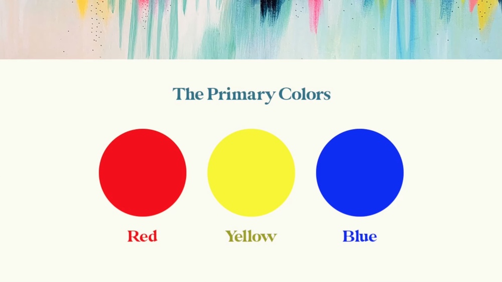
Have you ever wondered how to make the color blue? If you’re diving into painting, design, or any creative project, understanding blue is key.
While blue is known as a primary color, which means you can’t create pure blue by mixing other colors, there’s a lot you can do to work with it. You can create stunning shades, tints, and tones of blue that fit exactly what you need.
This guide will help you unlock the secrets of blue—how to adjust it, how to mix it in printing, and how to get those perfect blue hues that bring your work to life. Ready to explore the world of blue like never before? Keep reading, and you’ll discover easy tips that make your colors pop every time.

Credit: www.color-meanings.com
Why Blue Is A Primary Color
Blue holds a special place in the world of colors. It is one of the primary colors that cannot be made by mixing other colors. This unique status makes blue a fundamental part of color creation. Understanding why blue is a primary color helps artists and designers use it effectively.
What Are Primary Colors?
Primary colors are the basic colors that form all other colors. These colors include red, yellow, and blue. They cannot be made by mixing any other colors. Instead, you mix primary colors to create secondary and tertiary colors.
Blue In Traditional Color Models
In the traditional paint system, called RYB (Red, Yellow, Blue), blue is a pure primary color. You cannot create blue by combining other paints. Artists start with blue and mix it with other colors to make new shades and tones.
Blue In Modern Color Systems
In modern printing, the CMYK color model uses cyan, magenta, yellow, and black. Here, blue can be made by mixing cyan and magenta. This system is different from traditional paint mixing but still shows blue’s importance as a primary color base.
Limitations Of Mixing Blue
Blue is a primary color in most color systems. It cannot be created by mixing other colors. This creates limits for artists and designers who want pure blue. Understanding these limits helps in choosing the right colors for projects. It also helps to know how to adjust blue shades without making blue from scratch.
Pure Blue Cannot Be Mixed
Blue is one of the three primary colors in the RYB and RGB models. Primary colors form all other colors. Since blue is primary, mixing other colors cannot produce pure blue. Attempts to mix blue often result in dull or muted colors. This is why artists buy blue paint instead of mixing it.
Creating Blue Shades Requires Existing Blue
Different blue shades need a base blue color. You can make lighter blue by adding white paint. Darker blue is made by adding black or a darker color. Adding green or red changes the blue hue slightly. But these changes always start with a pure blue base.
Cmyk Model And Blue Creation
The CMYK color model used in printing mixes cyan and magenta to make blue. This is different from paint mixing. Cyan and magenta are not common household paint colors. This method works in digital and print but not in traditional painting. It shows how color mixing depends on the system used.
Creating Blue In Printing
Creating blue in printing involves a different process than traditional painting. Blue is a primary color in many systems, but printers use a mix of colors to achieve various blue shades. The printing industry relies on the CMYK color model. This model uses Cyan, Magenta, Yellow, and Black inks. By combining cyan and magenta inks, printers create blue hues. Understanding how these colors blend helps achieve vibrant and accurate blues in print.
Using Cyan And Magenta
Cyan and magenta are key inks for producing blue in printing. Cyan is a greenish-blue color, while magenta is a reddish-purple. When combined, these two inks absorb certain light waves and reflect blue light. The balance between cyan and magenta determines the exact shade of blue. More cyan yields a cooler blue, and more magenta creates a warmer tone. Printers adjust these inks carefully for the best results.
Adjusting Hue With Ratios
The ratio of cyan to magenta controls the hue and depth of the blue color. Increasing cyan produces a lighter, more vibrant blue. Adding more magenta shifts the color toward purple or violet shades. Small changes in these ratios can create different blue tones, such as royal blue or navy blue. By testing ink amounts, printers find the perfect mix for specific printing needs.

Credit: www.youtube.com
Lightening Blue Shades
Lightening blue shades is a simple way to create soft and gentle colors. It helps to produce a calm and airy feel in your artwork or designs. By adjusting the blue color with lighter tones, you can achieve a wide range of effects. The main method to lighten blue is by adding white, which creates what are called tints. These lighter blues are perfect for backgrounds, skies, and peaceful scenes.
Adding White For Tints
Start with your base blue color. Slowly mix in small amounts of white paint. Stir well after each addition. Watch the blue become softer and lighter. Adding white does not change the blue’s hue but makes it less intense. This process creates tints of blue. These tints are useful for highlighting or creating a sense of light. Keep adding white until you reach the desired shade. Remember, adding too much white can make the color lose its vibrancy.
Soft Pastel Blues
Soft pastel blues are gentle and easy on the eyes. They are made by mixing blue with plenty of white. These shades work well in baby rooms, spring themes, and calming designs. Pastel blues evoke a sense of peace and cleanliness. You can also add a tiny drop of other colors like pink or yellow to warm the pastel blue slightly. Use soft pastel blues to create a soothing atmosphere in your artwork or décor.
Darkening Blue Shades
Darkening blue shades adds depth and richness to your color palette. It transforms bright blues into more dramatic and intense tones. This process is useful for painting skies, oceans, and night scenes. It also helps create contrast and mood in your artwork.
Darkening blue is simple. Start with a base blue color. Then mix in a small amount of a darker color. Watch closely as the shade changes. Stop when you reach the desired darkness.
Adding Black For Tones
Adding black paint to blue creates darker tones quickly. Use a small brush to add black little by little. Mix thoroughly after each addition. Black deepens blue without changing its basic hue.
Be careful not to add too much black. Too much black can make the blue look muddy or gray. It is best to add black gradually for better control. This method gives you many options from medium dark to nearly black blues.
Deep Navy And Midnight Blues
Deep navy and midnight blue are popular dark blue shades. To make these, start with a strong blue base. Add black slowly to reach a rich, almost black blue.
You can also mix a touch of dark green or purple to deepen the blue naturally. These colors add complexity and richness to the tone. Deep navy works well for uniforms and formal designs. Midnight blue suits night skies and elegant scenes.
Altering Blue Hues
Altering blue hues allows artists to explore many shades and moods within the blue spectrum. By adjusting the base blue with other colors, you create cooler or warmer tones. This variation helps in painting skies, oceans, or even abstract art with unique blue shades.
Start with a pure blue and experiment by blending small amounts of other colors. Each addition changes the blue’s character, giving it depth and personality. The process is simple and opens up endless creative possibilities.
Mixing With Green For Cooler Blues
Adding green to blue creates cooler, refreshing blues. These shades remind you of clear water or pine forests. Use a small amount of green to avoid overpowering the blue. The result is a calm, soothing color perfect for nature scenes or backgrounds.
Adjust the green quantity to find the exact cool tone you want. More green makes the blue appear more teal or turquoise. Less green keeps it closer to the original blue. This method adds variety without losing the essence of blue.
Adding Red For Violet Blues
Mixing red into blue produces violet or purple blues. These hues feel rich and mysterious, ideal for dramatic effects. Use red sparingly to keep the blue dominant but with a warm hint. The balance creates a unique color that stands out.
Varying the red amount changes the shade from soft lavender to deep indigo. This technique helps artists paint shadows, twilight skies, or floral details. It expands the blue palette with warm undertones and depth.
Common Mistakes In Mixing Blue
Mixing the color blue can be confusing for many beginners. Blue is a primary color in most color systems. This means you cannot create pure blue by mixing other colors. Many people try common color mixes that do not produce blue. Understanding these mistakes helps you avoid frustration and waste.
Why Red And Yellow Don’t Make Blue
Red and yellow mix to form orange, not blue. These two colors are also primaries in the RYB system. Since blue is a primary color, it cannot be made by mixing any other colors. Trying to create blue from red and yellow will only result in muddy or brownish tones. This is a basic color theory rule that is important to remember.
Avoiding Muddy Colors
Mixing too many colors can cause dull, muddy results. Combining red, yellow, and blue often leads to this problem. To keep colors vibrant, limit mixing to two colors at most. Adding white or black to blue changes its shade or tone without muddiness. Use pure blue paint as your base for better results. Clean brushes and proper color amounts also help keep colors bright.
Using Acrylics To Adjust Blue
Using acrylic paints to adjust blue offers great control over the color’s shade and tone. Acrylics dry quickly and blend smoothly, making them ideal for modifying blues. You can create a wide range of blue variations by mixing different acrylic colors and applying various techniques.
Best Acrylic Colors For Mixing
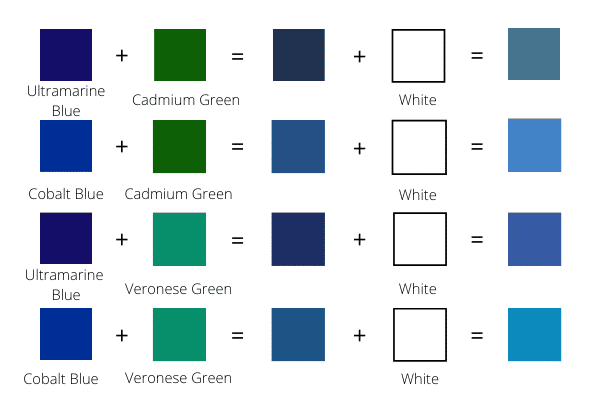
Start with a pure blue base like Phthalo Blue or Ultramarine Blue. These blues are vibrant and versatile. To lighten blue, add Titanium White gradually. For darker shades, mix in a small amount of Mars Black. To change the hue, try adding a touch of red or green. Red will shift blue toward purple, while green will create teal shades. Use small amounts of other colors to keep the blue dominant.
Techniques For Smooth Blending
Work quickly since acrylics dry fast. Blend colors on a palette before applying to your canvas. Use a clean, dry brush to soften edges between colors. You can also use a damp brush for smoother transitions. Layer thin washes of color for depth and richness. Avoid overmixing, which can dull the vibrancy of blue. Practice blending on scrap paper to perfect your technique before painting.
Tips For Vibrant Blue Shades
Creating vibrant blue shades requires careful choices and techniques. Simple steps can enhance the richness and brightness of your blue colors. Using the right materials and methods makes a big difference in your results.
Choosing Quality Pigments
Select pigments with strong color intensity and purity. High-quality pigments provide vivid and lasting blue tones. Avoid cheap or faded pigments that dull your colors. Look for pigments labeled as “phthalo blue” or “ultramarine blue” for rich results. Fresh pigments mix better and show true color.
Layering For Depth
Apply blue paint in thin layers to build color depth. Each layer adds richness and complexity to the shade. Let each layer dry before adding the next to prevent muddiness. Layering helps create a more vibrant and dynamic blue. Experiment with light and dark layers for varied effects.
Credit: artstudiolife.com
Troubleshooting Blue Color Mixing
Mixing blue paint can sometimes lead to unexpected results. Troubleshooting blue color mixing helps fix these issues quickly. Understanding common problems saves time and improves your artwork. Small adjustments make big differences in achieving the perfect blue shade.
Correcting Off-tones
Off-tones happen when blue looks too green, gray, or purple. To fix greenish blue, add a little red or orange. If blue turns gray, add a small amount of pure blue to brighten it. Purple tones appear when too much red mixes in. Lightly add yellow to balance purple shades back to blue.
Maintaining Color Consistency
Keep your blue color consistent by measuring paint amounts each time. Mix enough paint for the entire project to avoid color shifts. Stir paint well to blend colors evenly. Store mixed paint in airtight containers to prevent drying. Test your blue on paper before applying it on the final surface.
Frequently Asked Questions
What Colors Do I Mix To Make Blue?
Blue is a primary color and cannot be made by mixing other colors. In printing, mix cyan and magenta to create blue.
Do Yellow And Red Make Blue?
Yellow and red do not make blue. Blue is a primary color and cannot be created by mixing other colors.
Do Green And Purple Make Blue?
Green and purple do not make blue. Blue is a primary color and cannot be created by mixing other colors.
What Creates The Color Blue?
Blue is a primary color and cannot be created by mixing other colors. In printing, mix cyan and magenta to make blue.
Can You Mix Colors To Create Pure Blue?
Pure blue is a primary color and cannot be created by mixing other paint colors.
What Colors Mix To Make Different Blue Shades?
Adding white lightens blue; black darkens it; green or red changes its hue.
How Do I Make Light Blue Paint?
Mix blue paint with white to create a lighter shade of blue.
Can Cyan And Magenta Make Blue Color?
Yes, in printing, mixing cyan and magenta produces blue in the CMYK color model.
Why Can’t I Mix Primary Blue From Other Paints?
Blue is a basic primary color in the RYB model and cannot be mixed.
How To Make Royal Blue Color?
Mix blue with a small amount of red and a little black for royal blue.
Conclusion
Blue is a unique color that cannot be made by mixing paints. It is a primary color in most color systems. You can create many blue shades by adding white, black, or other colors to blue. Mixing cyan and magenta inks can produce blue in printing.
Experiment with different mixes to find your perfect blue shade. Understanding these basics helps you use blue effectively in art or design. Keep practicing to see how small changes affect the color. Blue will always remain a key part of your color palette.