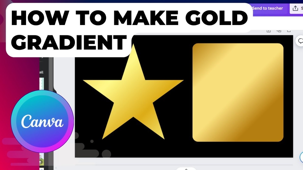
If you want to add a touch of luxury and shine to your designs, mastering how to make gold gradient colors is a game-changer. Imagine turning ordinary text, shapes, or backgrounds into stunning, realistic gold that catches the eye instantly.
You might think it’s complicated, but with the right steps, you can create smooth, dazzling gold gradients that elevate your work—whether you’re using Photoshop, Illustrator, or even Canva. Ready to learn the secrets behind that rich, metallic glow? Keep reading, and you’ll discover simple techniques and color combinations that bring your gold gradients to life with ease.

Credit: www.youtube.com
Choosing Gold Gradient Colors
Choosing the right colors is key to making a beautiful gold gradient. Gold is not a single color but a mix of yellows, browns, and sometimes hints of orange or white. These tones blend to create a shiny, metallic look that mimics real gold.
To create a gold gradient, select colors that move smoothly from light to dark. This helps add depth and shine to your design. Use warm hues that give a rich, glowing effect. Avoid colors that look flat or dull.
Understanding Gold Color Basics
Gold colors range from pale yellow to deep amber. The lightest parts look almost white or cream. The darkest parts are usually brown or bronze. Knowing these basics helps you pick colors that look natural and balanced.
Selecting Color Stops For Gradient
Add multiple color stops for a smooth transition. Start with a light yellow, then add gold tones, and finish with darker brown shades. This layering creates a rich and realistic gold effect.
Balancing Warm And Cool Tones
Gold is mostly warm, but small cool tones can add contrast. Use subtle hints of cool gray or muted orange to keep the gradient lively. This balance prevents the gradient from looking flat.
Using Hex Codes For Precision
Hex codes help pick exact colors. For gold, try codes like FFD700, FFC107, and B8860B. These codes ensure your gradient colors are consistent across different devices and software.
Setting Up Gradient Tools
Setting up the right tools is essential for creating a beautiful gold gradient. A smooth gradient depends on how well you prepare your workspace and tools. This section guides you through the basic setup steps. Follow each step carefully to get the best results.
Open The Gradient Tool
First, select the object you want to color. Look for the gradient tool in your design software. This tool lets you blend colors smoothly across the object. Click the tool to open the gradient panel or settings. This panel controls how colors change from one point to another.
Add Color Stops
Start with a simple black-to-white gradient. Then add more color stops to create depth. Color stops are points where the gradient changes color. For gold, use shades like yellow, orange, and light brown. Place these stops evenly for a smooth look. Adjust each color’s position to perfect the blend.
Adjust Gradient Angle And Type
Set the gradient angle to control the color flow. Gold gradients often look best with angles between 45 and 90 degrees. Choose the gradient type: linear or radial. Linear gradients blend colors in a straight line. Radial gradients spread colors from the center outward. Try both to see which fits your design.
Fine-tune Color Balance
Fine-tuning color stops improves realism. Move stops closer or farther apart to change the gradient speed. Use lighter tones for highlights and darker tones for shadows. This contrast makes the gold effect shine. Keep colors natural and avoid harsh edges.
Adding Multiple Color Stops
Adding multiple color stops is key to crafting a rich gold gradient. It helps blend different shades smoothly.
Each color stop introduces a new hue or tone. This creates depth and realism in your gold gradient.
Without multiple stops, the gradient may look flat or artificial. Using several stops mimics the natural shine of gold.
What Are Color Stops?
Color stops mark points on the gradient line. They tell your software where colors change.
You can place stops anywhere along the gradient. Each stop holds a specific color.
The software blends colors between stops to form the gradient effect.
Choosing Colors For A Gold Gradient
Select colors that range from dark to light gold. Include warm yellows, oranges, and soft browns.
Start with a deep brown or bronze for shadows. Add bright yellows and pale gold for highlights.
Use subtle shifts in hue and brightness. This makes the gradient look natural and shiny.
How To Add Multiple Color Stops
Open your gradient tool in the design software. Click along the gradient bar to add new stops.
Assign a gold shade to each stop. Adjust the position to control color transition smoothness.
Fine-tune stops by moving them closer or farther. This changes how quickly colors blend.
Tips For Smooth Color Transitions
Place stops close for sharp color changes. Space stops farther apart for soft blends.
Use intermediate colors between dark and light stops. This avoids harsh lines in the gradient.
Preview the gradient often. Adjust stops to achieve the desired gold shine effect.
Selecting Hex Codes For Gold
Selecting the right hex codes for gold is essential for a beautiful gradient. Gold has many shades, from light yellow to deep amber. Choosing hex colors that blend smoothly creates a rich and realistic effect. This section explains how to pick the best hex codes for gold gradients.
Understanding Gold Color Variations
Gold is not just one color. It includes yellows, oranges, and browns. These shades give gold its shine and depth. Use lighter yellows for highlights. Use darker browns or oranges for shadows. Mixing these tones makes the gradient look natural.
Choosing Base Gold Hex Codes
Start with a warm yellow as your base. Hex codes like FFD700 or FFC107 work well. These represent classic gold tones. They give a strong and bright start for the gradient.
Selecting Highlight Hex Codes
Highlights add shine and sparkle. Use very light yellows or near-white colors. Hex codes like FFF8DC or FFFACD create soft glows. Place these at the top or center of the gradient for brightness.
Picking Shadow Hex Codes
Shadows add depth and richness. Dark gold shades like B8860B or 8B7500 work well. These colors give warmth and contrast. Use them at the bottom or edges of the gradient for a smooth fade.
Testing And Adjusting Hex Codes
Test your hex codes by blending them in your design tool. Adjust brightness and saturation to avoid harsh lines. Aim for smooth transitions between colors. Small changes can improve the gold gradient greatly.
Adjusting Gradient Direction
Adjusting the gradient direction is key to creating a stunning gold gradient. It changes how the colors flow across your design. This adjustment helps highlight the shine and depth of the gold effect.
Changing the direction can make your gold gradient look more natural or stylized. It guides the light reflection, making the gradient appear more realistic. Small tweaks can greatly improve your final look.
Using The Gradient Tool To Change Direction
Most design software has a gradient tool for adjusting direction. Click and drag the tool across your shape. The angle of your drag sets the gradient flow. Experiment with different angles to see which fits best.
Setting Angle Values Manually
You can enter specific angle degrees for precise control. For example, 45 degrees creates a diagonal gradient. This method works well for consistent designs. It ensures your gold gradient matches your vision exactly.
Applying Radial Vs. Linear Gradients
Linear gradients move color in a straight line. Radial gradients spread color from the center outwards. Radial gradients often create a glowing gold effect. Choose the type based on the look you want.
Using Opacity For Depth
Using opacity in gold gradients creates a sense of depth and realism. It allows colors to blend softly, mimicking natural light reflections on gold surfaces. Adjusting opacity levels gives the gradient a layered and rich appearance. This technique helps avoid flat, dull gold tones and adds vibrancy to your design.
By varying opacity across different color stops, the gradient gains a smooth transition. The light parts appear shiny, and the darker parts look solid and deep. This balance creates a realistic metallic effect that catches the eye.
What Is Opacity In Gradients?
Opacity controls how transparent each color in the gradient appears. A lower opacity makes the color more see-through. A higher opacity makes it solid and bold. Using opacity changes the way colors mix and how light interacts with them.
How To Use Opacity For Gold Gradient Depth
Start by selecting your base gold colors. Apply them as stops in the gradient tool. Then, lower the opacity of some lighter stops. This creates soft highlights that look like light reflecting on gold.
Increase opacity on darker stops. This makes the gold look dense and rich. Adjusting these values carefully builds a natural shine and depth.
Tips For Smooth Opacity Transitions
Use small opacity changes between stops for smooth blending. Avoid sudden jumps in transparency. This keeps the gradient soft and natural. Experiment with different stops to find the perfect mix.
Test your gradient on different backgrounds. Opacity effects can look different depending on the colors behind them. Adjust as needed to keep the gold effect strong.
Applying Layer Styles
Applying layer styles is a key step in creating a realistic gold gradient. Layer styles add depth, shine, and texture to your design. They allow you to simulate the light reflection that gold naturally has.
This process is simple but requires attention to detail. Use Photoshop or similar software that supports layer styles. Adjusting each effect carefully will make your gold gradient look polished and professional.
Creating A New Layer
Start by creating a new layer above your base color. This layer will hold your gradient and the styles you apply. Keeping layers separate helps you adjust effects without changing the original image.
Adding Gradient Overlay
Open the layer styles panel and select Gradient Overlay. Choose a gold gradient preset or create your own using warm yellow, orange, and brown tones. Set the angle to control the light direction.
Using Bevel And Emboss
Bevel and Emboss adds dimension by simulating light and shadow. Adjust the depth, size, and softness to create a subtle raised effect. This step makes the gold look more three-dimensional and shiny.
Applying Satin Effect
The Satin effect adds a smooth, glowing texture inside the layer. Use a dark gold or brown shade for the color. Adjust the distance and size to enhance the natural shine of the gold gradient.
Finishing With Outer Glow
Outer Glow creates a soft light around your object. Use a light yellow or gold color and set the blend mode to Screen or Overlay. This final touch boosts the brightness and adds a glowing finish.

Credit: virtualprecision.co.uk
Incorporating Texture Overlays
Incorporating texture overlays adds depth and realism to gold gradient colors. Plain gradients can look flat and dull. Texture overlays mimic the natural imperfections found in real gold surfaces. These details catch light and create a shiny, metallic feel.
Using textures like foil, brushed metal, or grainy patterns enhances the gradient’s richness. It helps the gold appear more vibrant and dynamic. Textures also break up the smooth color transitions. This makes the gradient feel more natural and less digital.
Choosing The Right Texture Overlay
Select a texture that matches the style of your gold gradient. Foil textures give a shiny, reflective look. Brushed metal textures create a subtle, sleek finish. Grainy or speckled textures add an aged or rustic effect. Use high-resolution textures for better results.
Applying Texture Overlays In Design Software
Place the texture layer above your gold gradient layer. Set the blending mode to options like Overlay, Soft Light, or Multiply. Adjust the opacity to control the texture’s intensity. Use layer masks to apply texture selectively on certain areas.
Adjusting Color And Contrast For Realism
Tweak the brightness and contrast of your texture layer. This helps blend the texture naturally with the gold gradient. Use hue and saturation adjustments to match the gold tones. Small changes can significantly enhance the metallic effect.
Creating Gold Gradients In Photoshop
Creating gold gradients in Photoshop allows designers to add a rich, metallic look to their projects. Gold gradients simulate the shine and depth of real gold, making text, shapes, and backgrounds more eye-catching. Photoshop offers tools to build smooth, realistic gold effects with ease.
Using layers, color stops, and blending modes, you can craft a gradient that transitions from dark to light gold tones. This method enhances the visual appeal and adds a professional touch to your designs. Follow these steps to create beautiful gold gradients in Photoshop.
Opening The Gradient Editor
Start by selecting the Gradient Tool from the toolbar or press the letter G. Click on the gradient preview bar in the top menu to open the Gradient Editor. Here, you will customize the colors to form your gold gradient.
Choosing Gold Color Stops
Replace the default colors with gold shades. Add multiple color stops to blend dark brown, yellow, and light cream tones. Use hex codes like b8860b, ffd700, and fff8dc for natural gold hues.
Adjusting Color Stop Positions
Move each color stop to balance the gradient smoothly. Place darker colors near the edges and lighter ones in the center. This creates a shiny effect that mimics real gold reflections.
Applying The Gradient
Drag the Gradient Tool across your selected area to apply the gold gradient. Adjust the angle and length of the drag to control the gradient’s flow. Experiment until you achieve a natural gold look.
Enhancing With Layer Styles
Add layer styles like Bevel & Emboss and Satin to boost the metallic feel. These effects add highlights and shadows, giving depth and texture to your gradient. Fine-tune the settings to match your design needs.
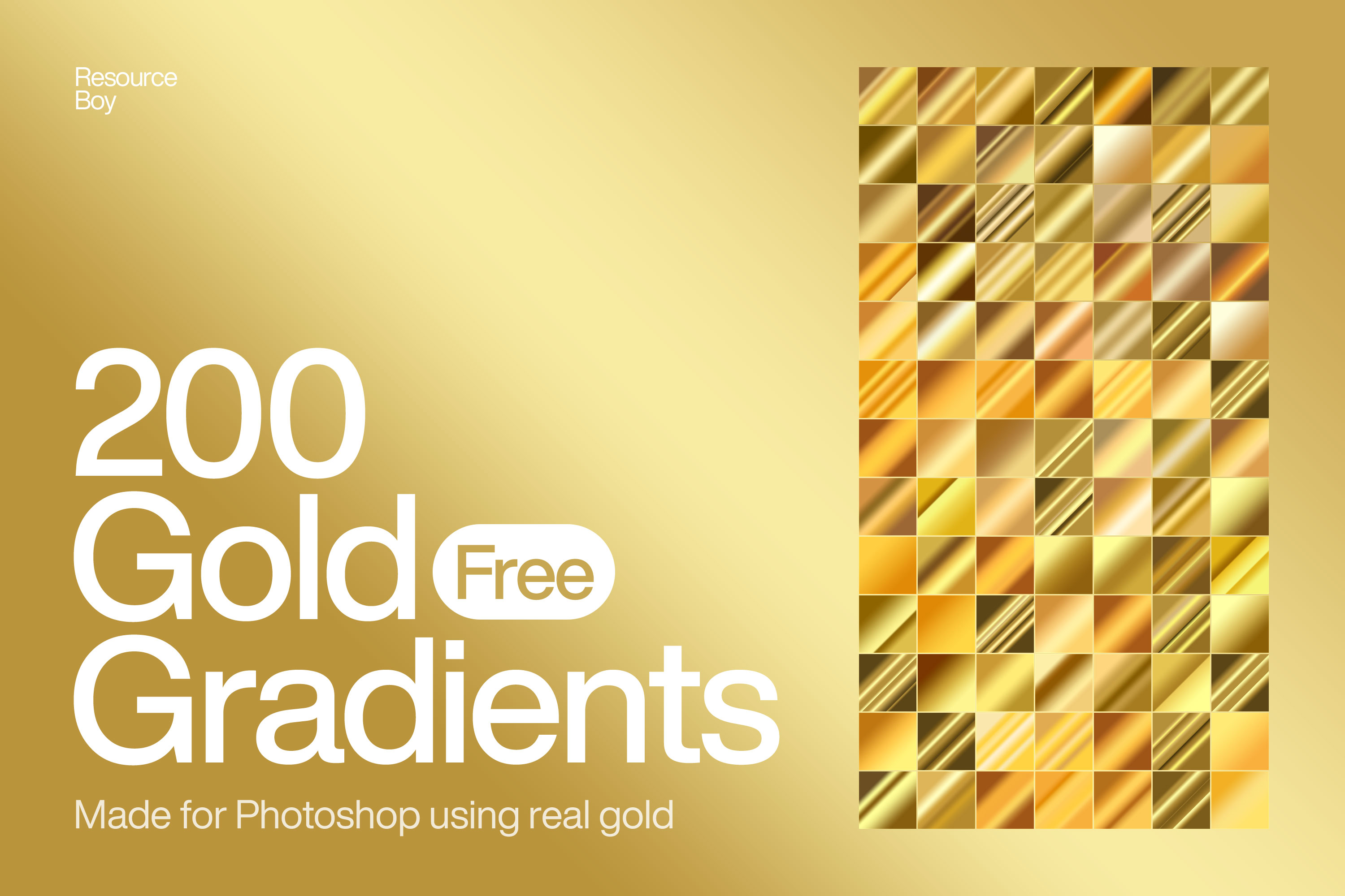
Credit: resourceboy.com
Making Gold Gradients In Illustrator
Creating gold gradients in Adobe Illustrator gives your designs a rich, shiny look. Gold gradients blend warm yellows, oranges, and light browns. These colors mimic the natural shimmer of gold. Illustrator offers powerful tools to craft smooth, realistic gold gradients.
Using Illustrator’s gradient tools, you can customize colors and angles. This control helps achieve a smooth metallic effect. The process is simple and works well for text, shapes, and icons.
Opening The Gradient Panel
Start by selecting your object or text. Next, go to the Window menu and choose Gradient. This opens the Gradient panel where you control the gradient style and colors. You can switch between linear or radial gradients for different effects.
Adding And Adjusting Color Stops
In the Gradient panel, you see a bar with color stops. Click below the bar to add new stops. Use shades of yellow, gold, and brown. Adjust each stop’s position to blend colors smoothly. This layering creates the shiny gold look.
Setting Gradient Type And Angle
Choose between linear or radial gradient types. Linear gradients flow in a straight line, perfect for text. Radial gradients spread from the center, ideal for round objects. Adjust the angle slider to change the gradient direction. This adds depth and realism.
Fine-tuning With Opacity And Location
Each color stop lets you set opacity. Lower opacity can soften highlights. Move stops closer or farther to change color transitions. These tweaks help simulate the reflective quality of gold metal.
Saving Your Gold Gradient For Reuse
Once satisfied, save your gradient. Click the New Swatch button in the Swatches panel. Name your gold gradient for easy access later. This saves time on future projects and keeps your designs consistent.
Frequently Asked Questions
How To Make Gold Color Gradient?
Create a gold gradient by adding multiple color stops from dark brown to bright yellow. Adjust stops for smooth transitions. Use hex codes like b8860b, ffd700, and fffacd. Apply gradient tool to blend colors evenly. Add layer styles like Bevel & Emboss for a metallic effect.
What Colors Do I Mix To Get Gold?
Mix yellow and orange with small amounts of red and brown to create a rich gold color. Add white for highlights.
What Is The Code For Gold Gradient?
The gold gradient code includes hex colors like D4AF37, FFD700, FFB700, B8860B, and F0E68C. Use these in gradients for a metallic gold effect.
How To Create A Gold Gradient In Illustrator?
Open Illustrator’s Gradient panel and select your object. Add five color stops with gold tones from dark brown to bright yellow. Adjust stops to blend smoothly. Use the Gradient Tool to refine direction and scale. Apply highlights and shadows for metallic shine.
Save your gold gradient for reuse.
What Is A Gold Gradient Color?
A gold gradient color blends shades of yellow, orange, and brown to mimic real gold.
How Do You Create A Gold Gradient In Photoshop?
Use the Gradient Tool with gold shades and adjust color stops for smooth blending.
Which Colors Make A Realistic Gold Gradient?
Use yellow, orange, brown, and white shades for a shiny, metallic look.
Can Gold Gradients Be Used In Web Design?
Yes, gold gradients add elegance and depth to buttons, backgrounds, and icons.
What Tools Help Create Gold Gradients Easily?
Photoshop, Illustrator, Canva, and CSS are popular tools to make gold gradients.
How To Make A Smooth Gold Gradient Effect?
Add multiple color stops and adjust opacity for a soft and shiny appearance.
Conclusion
Creating a gold gradient is simple and fun with the right steps. Use multiple color stops for smooth color changes. Choose shades from dark brown to bright yellow for a real gold look. Adjust the gradient direction to fit your design style.
Practice often to improve your technique and get better results. This skill adds a shiny, elegant touch to your projects. Keep experimenting with colors and tools to find what works best. Your designs will shine with a beautiful gold gradient effect.