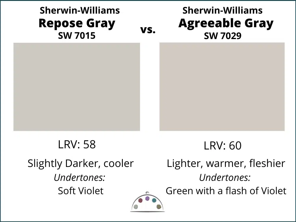
Choosing the right paint color can transform your space and set the tone for your home. If you’re torn between Sherwin Williams’ Repose Gray and Agreeable Gray, you’re not alone.
Both shades are incredibly popular, but they bring different vibes to your interiors. You might be wondering which one is better suited for your home or which will complement your existing decor. We’ll dive deep into the nuances of Repose Gray and Agreeable Gray.
You’ll discover their unique undertones, ideal applications, and tips on how to choose the perfect shade for your needs. By the end, you’ll have the clarity you need to make a confident decision for your next painting project. Let’s explore these two captivating grays and find out which one is right for you!
Color Profiles
Choosing the right gray for your space can be tricky. Repose Gray and Agreeable Gray are popular choices. Each color has unique features. Understanding these profiles helps in making a decision.
Repose Gray Characteristics
Repose Gray is a light gray with subtle warmth. It has a clean and modern feel. This color works well in various lighting conditions. It can appear slightly cooler in bright light. In dimmer spaces, it takes on a warmer tone.
Repose Gray pairs nicely with white trim. It complements both contemporary and traditional styles. This shade is versatile for different design themes. It creates a calm and serene atmosphere in any room.
Agreeable Gray Characteristics
Agreeable Gray is a warm greige color. It combines gray and beige tones effectively. This color has subtle green undertones. It feels cozy and inviting, making spaces feel welcoming.
Agreeable Gray works well with warm colors. It enhances wooden elements and other natural finishes. This shade is perfect for living rooms and bedrooms. It provides a soft backdrop for various decor styles.
Undertones And Temperature
Understanding undertones is key in choosing paint colors. Undertones affect how colors look in different lights. Repose Gray and Agreeable Gray have distinct undertones. This makes them unique and suitable for various spaces. Let’s explore their cool and warm undertones.
Cool Undertones Of Repose Gray
Repose Gray features cool undertones. It leans toward blue and violet shades. This gives it a crisp, modern look. It works well in bright spaces. Repose Gray shines in rooms with lots of natural light.
In dim light, its coolness can appear softer. It pairs nicely with white trim. This enhances its sleek appearance. Use it in bedrooms or living rooms for a calming effect.
Warm Undertones Of Agreeable Gray
Agreeable Gray has warm undertones. It leans toward beige and taupe. This creates a cozy and inviting feel. It works well in spaces where comfort is key.
In rooms with warm lighting, Agreeable Gray feels rich. Its warmth complements wood tones beautifully. This makes it a popular choice for family rooms and kitchens.
Choosing between these colors depends on your space’s lighting. Consider the mood you want to create. The right undertone can transform your home.
Room Suitability
Choosing the right color for your room is vital. Repose Gray and Agreeable Gray each have unique qualities. Understanding where to use these colors can enhance your space. Let’s explore the best areas for both shades.
Best Spaces For Repose Gray
Repose Gray works well in modern and open areas. Its cool undertones create a calm atmosphere. Living rooms benefit from its serene vibe. Repose Gray also suits bedrooms, promoting relaxation. Consider it for bathrooms where a fresh look is desired. It pairs nicely with natural light.
Best Spaces For Agreeable Gray
Agreeable Gray shines in cozy, inviting spaces. It is perfect for family rooms and kitchens. The warm undertones create a welcoming feel. This color also works well in hallways and entryways. It complements a range of decor styles easily. Use it in rooms that need a touch of warmth.
When Not To Use These Colors
Avoid Repose Gray in dark or poorly lit rooms. Its coolness can feel uninviting in such spaces. Agreeable Gray may not suit areas with strong cool tones. It can appear dull under harsh lighting. Consider existing furniture colors before choosing. Personal preference matters; if you dislike a color, skip it.
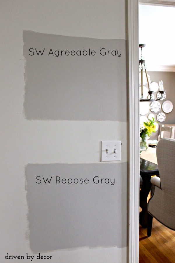
Credit: www.drivenbydecor.com
Lighting Impact
Lighting plays a crucial role in how colors appear in a space. The same shade can look different under various lighting conditions. Understanding how Repose Gray and Agreeable Gray react to light can help you choose the right color for your home.
How Repose Gray Reacts To Lighting
Repose Gray often appears lighter in bright light. It reflects natural light beautifully. This color can look almost white in sunny rooms. In dimmer spaces, it may take on a cooler tone. The undertones become more noticeable in low light.
In rooms with northern exposure, Repose Gray can seem cooler. This can create a serene, calming effect. However, it may not always be suitable for cozy spaces. Ensure your lighting complements this shade for the best results.
How Agreeable Gray Reacts To Lighting
Agreeable Gray tends to be warmer under various lighting conditions. It shows a soft, greige tone that feels inviting. In bright spaces, it maintains its warmth and looks balanced. In darker rooms, it can appear slightly muted but still cozy.
With cool lighting, Agreeable Gray may lose some warmth. It can appear dull in these settings. This color works best in well-lit areas to show its true beauty. Consider your light sources when choosing this shade.
Comparing Reflectance Values
Understanding the reflectance values of Repose Gray and Agreeable Gray can help you make an informed choice for your space. These values indicate how much light a paint color reflects, impacting the overall feel of a room. A higher reflectance value can brighten up a space, while a lower one can create a more subdued atmosphere.
Reflectance Values Overview
Repose Gray has a reflectance value of 58, making it a versatile option for various lighting conditions. It reflects a good amount of light, which can help smaller rooms feel more open and airy.
Agreeable Gray, on the other hand, boasts a reflectance value of 59. This slight difference means it also reflects light well but with a warmer tone, which can add coziness to your space. Both colors are excellent choices, but the subtle variations in reflectance may influence your decision based on the desired atmosphere.
How Lighting Affects Perception
Consider how natural light plays in your room. Repose Gray can appear cooler in spaces with north-facing windows or limited sunlight. If your room has abundant light, this color can maintain its elegance without feeling too stark.
Agreeable Gray tends to shine in warmer lighting conditions. If your room receives lots of natural light, you might find this shade offers a welcoming, soft ambiance. Have you noticed how the same color can look entirely different at different times of the day?
Choosing Based On Functionality
Think about the function of your room. If you’re painting a living area where you entertain guests, Repose Gray can provide a modern, sophisticated backdrop. On the other hand, if you’re looking to create a relaxing bedroom, Agreeable Gray might be the better choice, as it promotes a calm and serene environment.
Ultimately, your choice should reflect the mood you want to create. Are you leaning toward a more contemporary look or a cozy, classic feel? Your space should feel like home, and the right gray can help you achieve that.
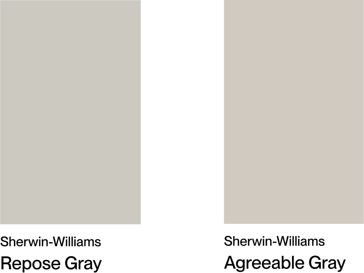
Credit: yourpaintconsultant.com
Trendy Or Timeless
Choosing between Repose Gray and Agreeable Gray often comes down to personal style and the atmosphere you want to create in your space. Are you leaning toward a trendy look that evolves with the times, or do you prefer a timeless palette that remains classic? Let’s break down how these two shades fit into modern and classic design.
Agreeable Gray In Modern Design
Agreeable Gray has taken the design world by storm. Its warm undertones make it incredibly versatile, fitting seamlessly into contemporary aesthetics. You can see it in open-concept spaces that aim for a cozy yet modern feel.
This color works wonders in rooms flooded with natural light. It adds warmth without overwhelming the space. Picture a chic living room with white trim and black accents—Agreeable Gray ties it all together beautifully.
Have you considered how your furniture and decor influence your paint choice? The soft, greige hue of Agreeable Gray complements modern furnishings, making it a popular choice among homeowners and designers alike.
Repose Gray For A Classic Appeal
If you’re drawn to a more classic aesthetic, Repose Gray might be your go-to. This shade leans cooler and provides a refined backdrop for traditional furnishings. Think of it as a sophisticated canvas that enhances the elegance of classic design elements.
Repose Gray shines in spaces with rich textures and layered lighting. It can make a statement in dining rooms or studies where you want to evoke a sense of timelessness. Imagine dark wood furniture against the soft gray—it creates a stunning contrast that feels both inviting and upscale.
Are you ready to create a space that feels enduring? Repose Gray’s subtlety allows you to experiment with bolder colors in your decor without clashing. The result is a balanced aesthetic that stands the test of time.
Room-by-room Comparisons
Repose Gray and Agreeable Gray each offer unique qualities for home interiors. Repose Gray is darker and cooler, while Agreeable Gray leans warmer with subtle beige undertones. Choosing between them depends on room lighting and existing decor, making room-by-room comparisons essential for the perfect match.
When choosing between Repose Gray and Agreeable Gray, it’s essential to consider how each color interacts with the unique characteristics of different rooms in your home. Each space has its own personality, and the right shade can enhance that vibe. Let’s break down how these two popular colors perform in living rooms, kitchens, and exteriors to help you make an informed decision.Living Rooms
In a living room, you want a color that fosters warmth and comfort. Agreeable Gray shines here with its warm undertones, creating an inviting atmosphere.You might find that it complements your furniture beautifully, especially if you have warm wood tones or earthy accents.On the other hand, Repose Gray offers a modern, clean aesthetic. Its cooler tone can provide a sophisticated backdrop for vibrant art or decor.Consider your lighting. If your living room has plenty of natural light, Repose Gray can look stunning and elevate the space.Kitchens
Kitchens require a color that feels fresh and clean. Agreeable Gray is often favored for this space due to its versatility and warm appeal.It pairs well with white cabinetry and stainless steel appliances, creating a harmonious flow.Repose Gray also works well but brings a slightly more contemporary feel. If your kitchen has a lot of natural light, Repose Gray can make the space feel airy and open.Are you aiming for a cozy, inviting kitchen or a sleek, modern one? Your choice between these two colors could significantly impact the vibe you create.Exteriors
For exteriors, color choice can affect curb appeal and set the tone for your entire home. Agreeable Gray is a popular option for siding, as it harmonizes beautifully with landscaping and brick accents.It gives a welcoming look that works well in suburban settings.Repose Gray, with its darker and cleaner appearance, can add a touch of elegance and sophistication. It’s ideal for more modern homes or those looking to stand out in a neighborhood.Which color reflects your style and complements your home’s architecture?Choosing between Repose Gray and Agreeable Gray ultimately depends on the ambiance you wish to create in each room. Consider your personal style, existing decor, and the natural light in your spaces before making your decision.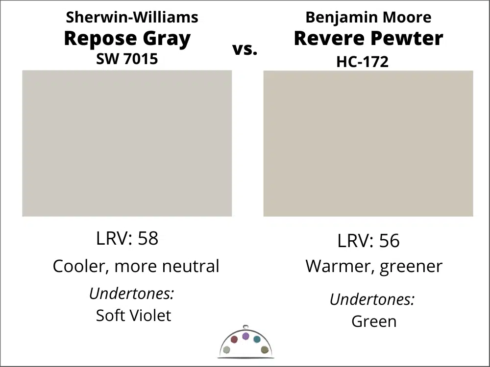
Credit: thecolorconcierge.com
Personal Preferences
Repose Gray and Agreeable Gray are popular paint colors with distinct characteristics. Repose Gray is cooler and darker, while Agreeable Gray offers a warmer, greige tone. Choosing between them depends on personal style and the lighting in your space. Each brings a unique feel to home interiors.
Choosing the right paint color often comes down to personal preferences. Repose Gray and Agreeable Gray are two popular shades from Sherwin Williams, each with unique characteristics. Understanding how personal style and existing elements in your space influence your choice can help you create a harmonious environment.Choosing Based On Style
Your style plays a crucial role in selecting between Repose Gray and Agreeable Gray. Repose Gray is a cooler, more modern option. It pairs beautifully with contemporary decor, giving your space a fresh, clean look.On the other hand, Agreeable Gray leans warmer and offers a cozy, inviting feel. It complements traditional or farmhouse styles well. Think about the atmosphere you want to create. Do you prefer a sleek, modern vibe, or a warm, welcoming ambiance?Consider how each color resonates with your personality. Do you lean towards tranquility and simplicity, or do you enjoy warmth and comfort in your surroundings? Trust your instincts; your home should reflect who you are.Considering Fixed Elements
Fixed elements in your space, such as flooring, furniture, and natural light, can significantly influence your choice. If your flooring has warm tones, Agreeable Gray might enhance that warmth. It can tie the room together beautifully.Conversely, if your furniture and decor lean towards cooler shades, Repose Gray could be the better fit. It often provides a striking contrast that feels intentional and sophisticated.Take a moment to evaluate the existing colors in your home. Are there any elements that you love and want to highlight? Think about how each gray can either complement or clash with what you already have. Your choices should work in harmony with your fixed elements, creating a cohesive look.Which shade aligns with your vision for your space? Let your preferences guide you in creating a home that feels uniquely yours.Frequently Asked Questions
Which Is Better, Agreeable Gray Or Repose Gray?
Agreeable Gray is warmer and more versatile, while Repose Gray is cooler and slightly darker. Choose Agreeable Gray for a cozy feel and Repose Gray for a modern, crisp look. Your preference and room lighting will ultimately determine which shade is better for your space.
What Is Joanna Gaines’ Favorite Grey Color?
Joanna Gaines’ favorite grey colors include Sherwin Williams Mindful Gray, Oyster Pearl, and Passive Gray. She often uses these shades in main living spaces for a warm, inviting atmosphere. Repose Gray is also a popular choice, being one shade lighter than Mindful Gray.
When Not To Use Repose Gray?
Avoid using Repose Gray in rooms with poor lighting or overly warm tones. It may appear too cool or stark in such environments. Also, steer clear of this color for spaces needing a cozy, inviting feel. Consider alternatives for those specific situations.
When Not To Use Agreeable Gray?
Avoid using Agreeable Gray in rooms with cool lighting or strong warm tones. It may clash with existing decor or feel dated as trends change. If you dislike its warm undertones, consider other options. Assess your space’s overall color scheme before making a decision.
Conclusion
Choosing between Repose Gray and Agreeable Gray depends on your space. Repose Gray offers a cooler, cleaner look. It works well in bright rooms. Agreeable Gray brings warmth and soft tones. It suits cozy, inviting spaces. Consider the lighting in your rooms.
Both colors can create different moods. Test samples on your walls. Observe how they change with light. Ultimately, pick what feels right for you. A personal touch makes your space unique. Enjoy the process of finding your perfect gray!